

Visualizing the industry
Pesmel Oy packaging machinery
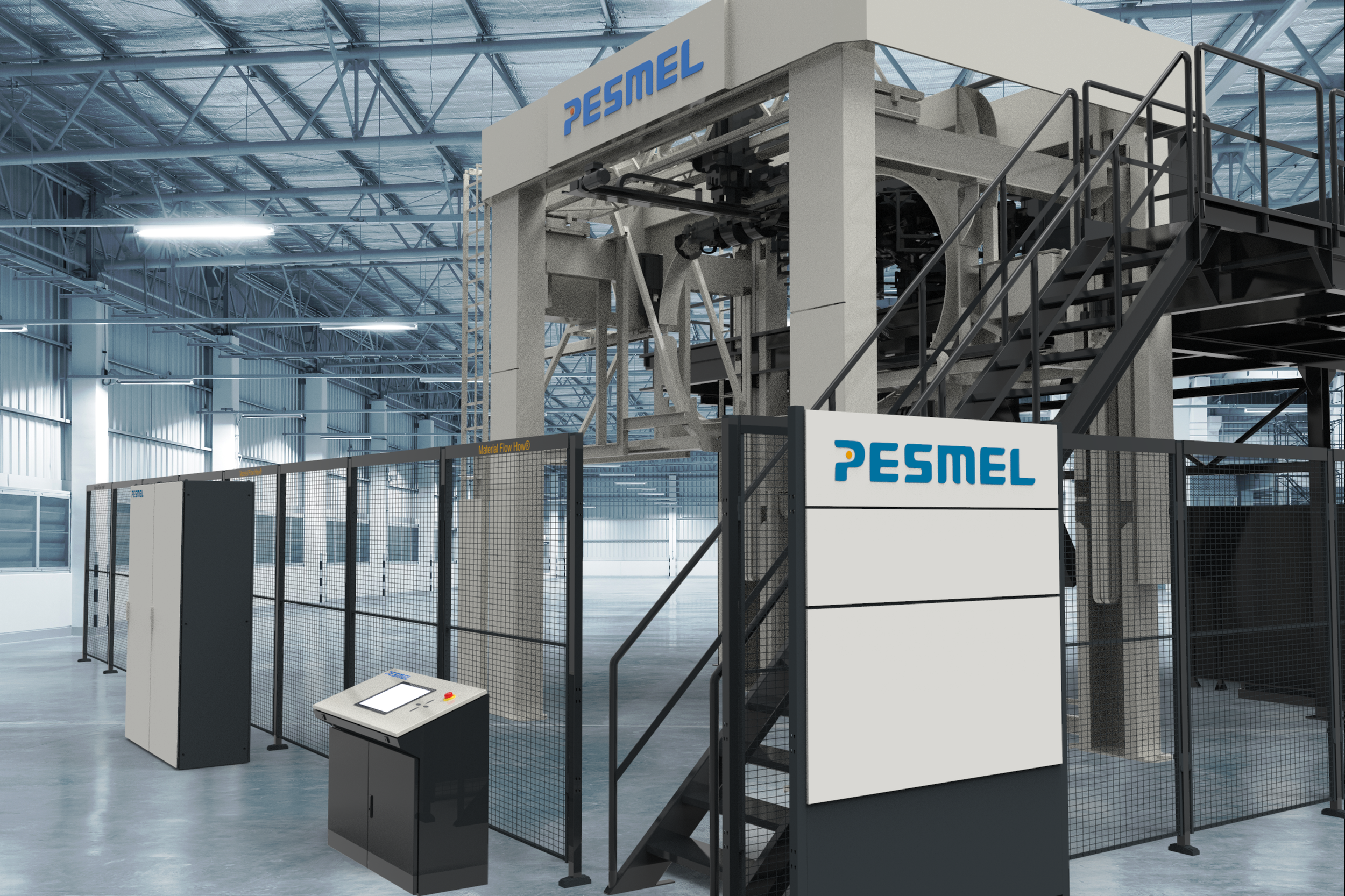
As a designer at Pesmel, I was responsible for developing and refining the colorways for the company’s industrial machines and automated packaging lines. The project was initially developed as part of my bachelor’s thesis, focusing on creating a cohesive visual identity that aligned with Pesmel’s brand while enhancing the recognition and clarity of its equipment in demanding industrial environments. Following the completion of my thesis work, I continued collaborating with the company to further develop and implement the design system in real-world applications.
Role industrial designer
Focus visual identity and branding
Client Pesmel Oy
Deliverables design language and 3D visualization
01 Project overview
02 the challenge
Through research, concept development, and color studies, I explored combinations that balanced functionality, durability, and aesthetics. The final color schemes were applied across machine components and packaging systems, contributing to a consistent and modern visual language that strengthened the company’s brand presence and reflected the innovation behind its technology.
The companys strengths and main focus is on engineering their products and systems and unfortunately the visual design of their machinery was in a need of an update. They do have a brand book but it mostly consists of logo usage and its guidelines. During initial conversations with the company it became clear that design as a concept and as a way to help them was not something they were familiar with.
Pesmel's packaging machines are highly technical products designed around demanding industrial processes. The challenge was to develop a visual language that could make the machines feel more cohesive, recognizable and modern while respecting their existing technical architecture.
Brand expression
The Pesmel brand needs to be seen in the physical world not just in logos or printed materials.
Technical complexity
The machinery have alot of components, structures and techincal functions. These have to be taken into account.
Product consistency
A recognizable brand look is needed between the different machinery.
03 research
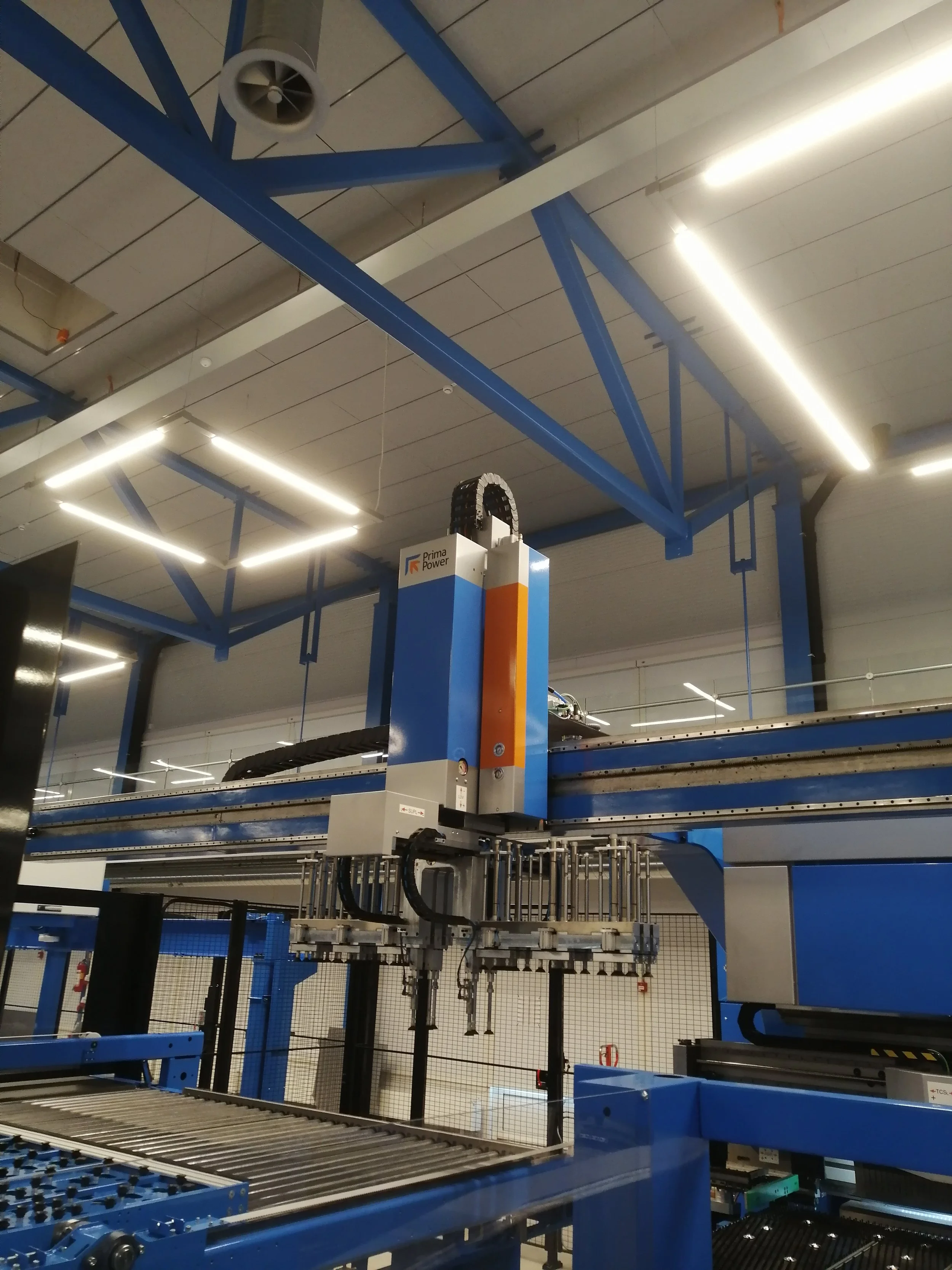
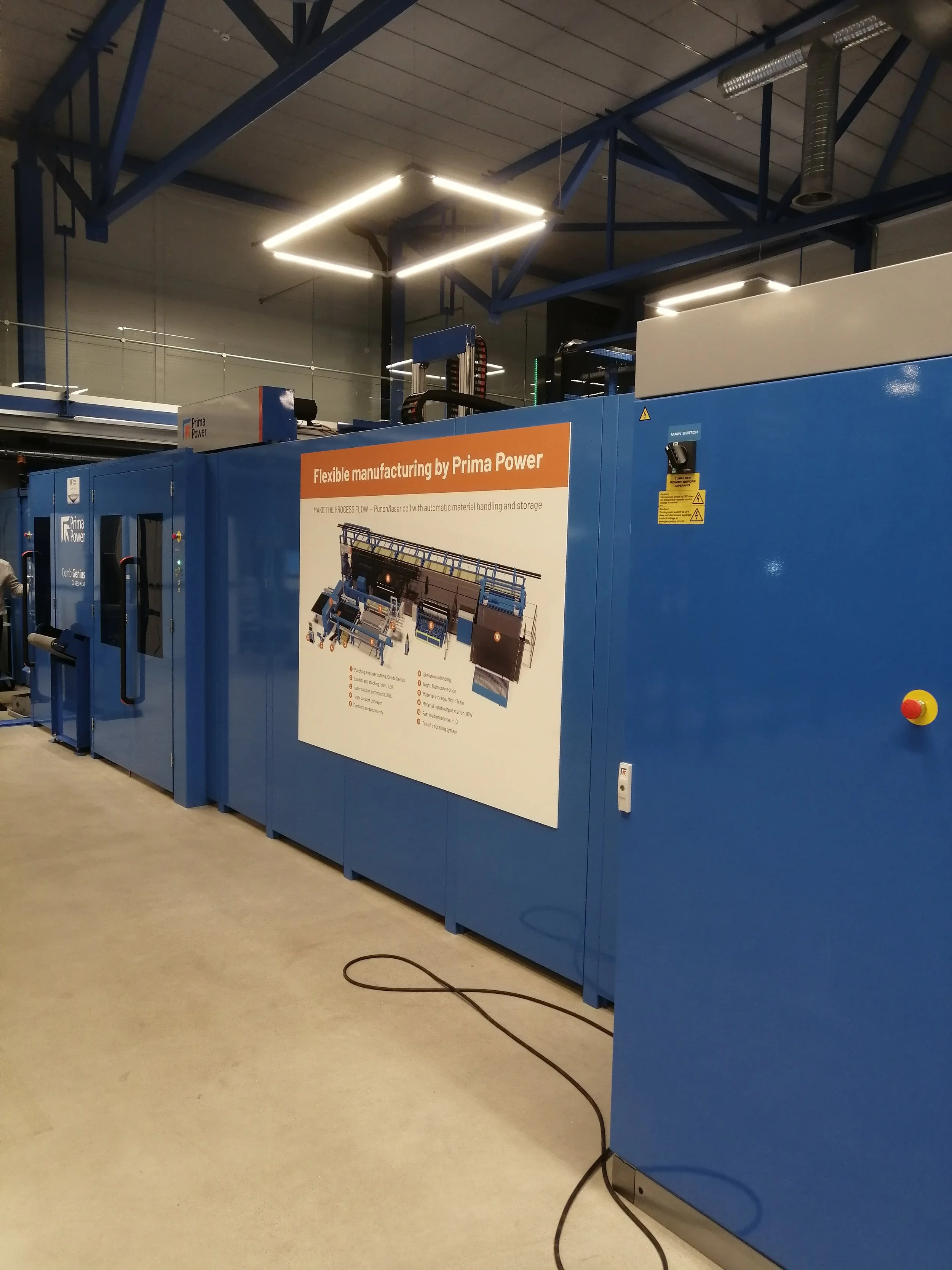
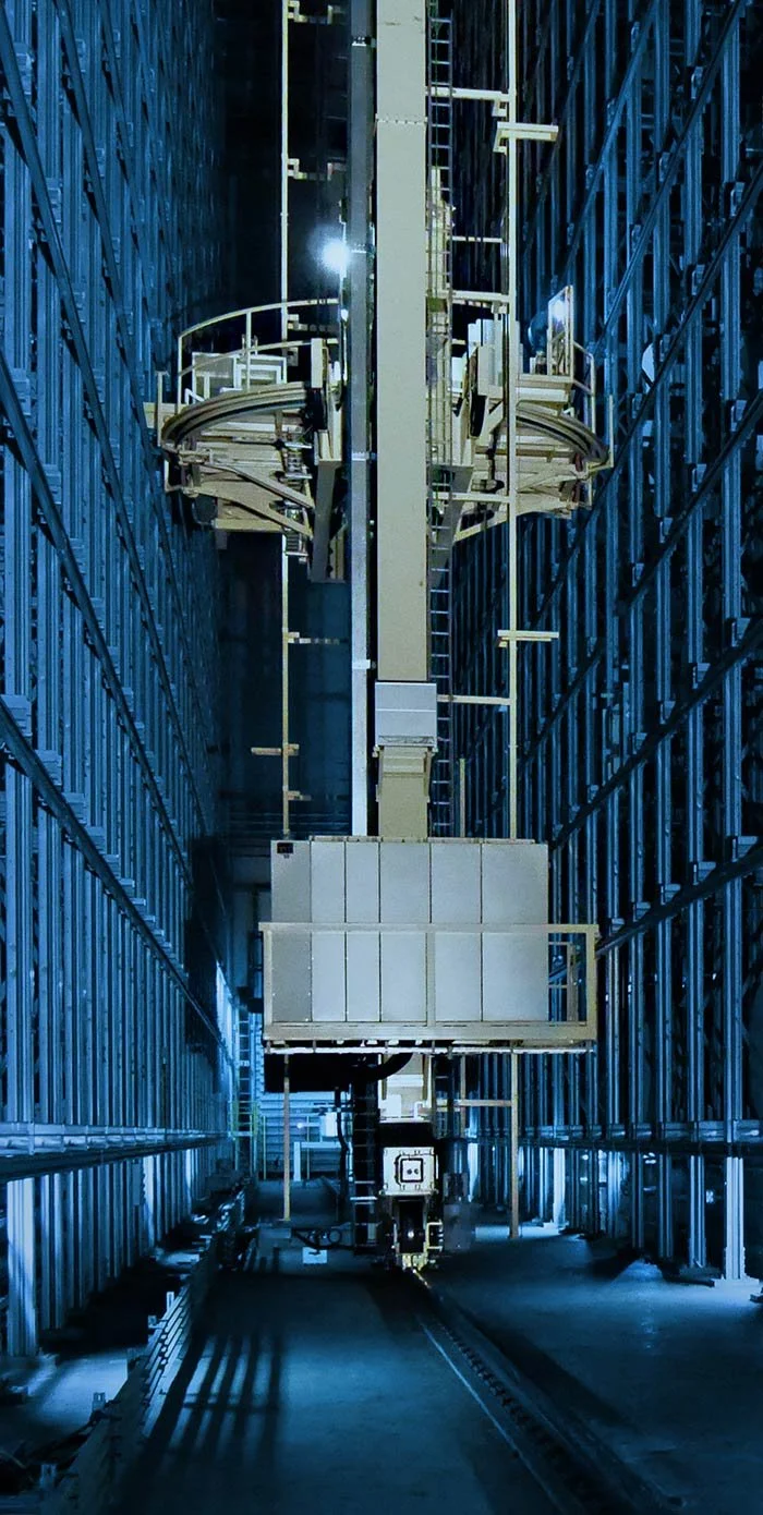
Companies on related industries needed to be studied and used as benchmarks. I decided not go to plants of competitors of the exact machinery but into factories where similar design challenges and objectives had been accomplished. Studying these factories and talking with the representatives gave me a good understanding of how they had implemented their brand into their complex machinery.
Showing successful project outcomes to Pesmels representatives gave them a good understanding what the concept of having a universal brand look actually meant and how it could improve their image as a company.
Existing products
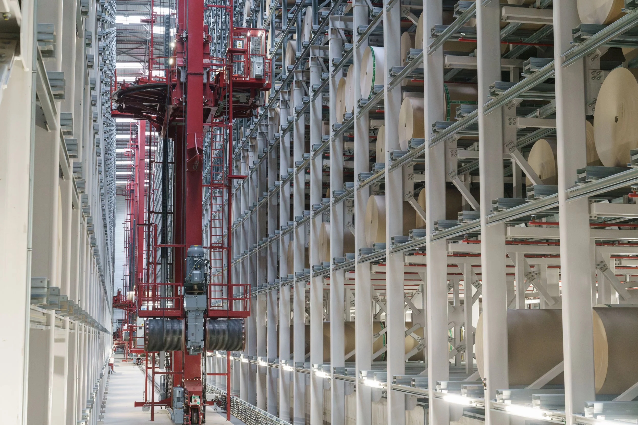
Before developing a new visual language, I mapped the existing product architecture to understand the current systems that are being used globally and where visual design could create a stronger identity. It became obvious that the exact same system could hold totally different visual looks.
The existing brand look on the machines were not always applied consistently across different products.
Design opportunity
Create a visual system that makes different machines feel like members of the same product family.
04 design principles
Consistent
The same principles should work across different machine configurations.
Recognizable
The machine should be identifiable as a Pesmel product even without relying on the logo.
Technical
The visual language should communicate engineering and industrial performance.
Controlled
Reduce unnecessary visual noise and create clearer hierarchy between components.
Practical
Visual design must work within existing manufacturing, maintenance and safety requirements.
05 the CMF system
Colorway prototypting
Initial rendering based on the companys main coloring system made a significant improvement to the machineries design principles but after consideriation with the engineers this type of coloring would be too harsh on the everyday user to work with hours on end. The coloring system needed to be something more neutral without losing the recognizable and consistent Pesmel brand look.
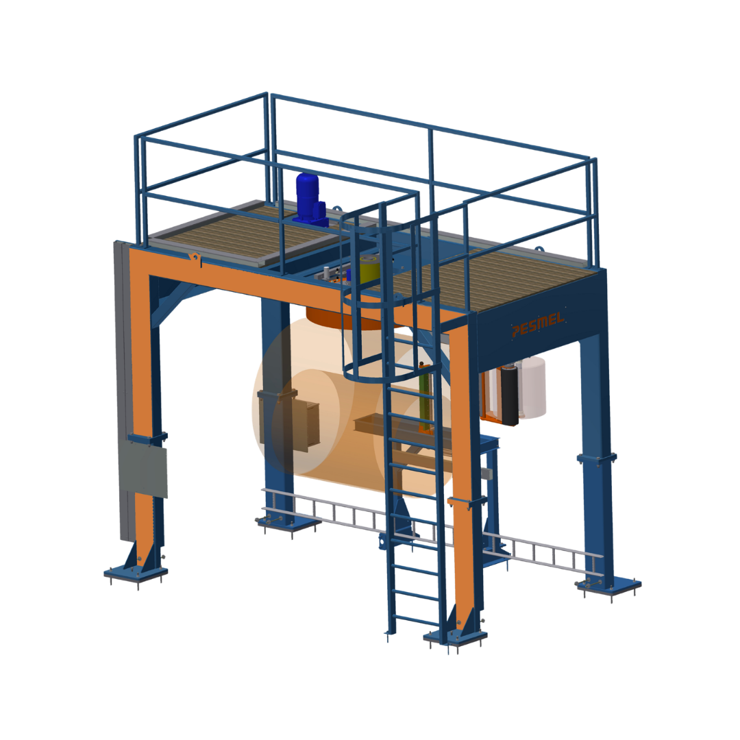
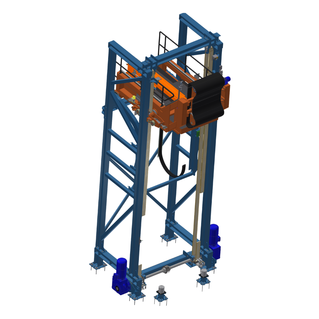
Coloring system
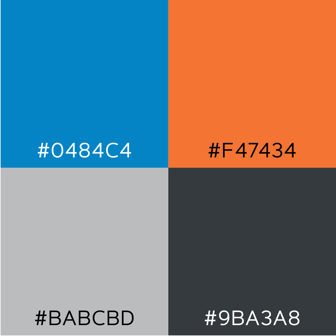
After meeting with the stakeholders it became clear that calmer colorways were needed. Because of this I created a coloring system where the main colors became two neutral shades of cold grey. Lighter shade as the primary machinery body color and the darker shade for secondary structural element color.
The main logo colors became accent colors to be used in a meaningful way while being a way to recognize the machinery as a part of the Pesmel family. The primary Pesmel orange can be used as an safety relate color for moving elements and the primary Pesmel blue for interaction areas.
Material studies
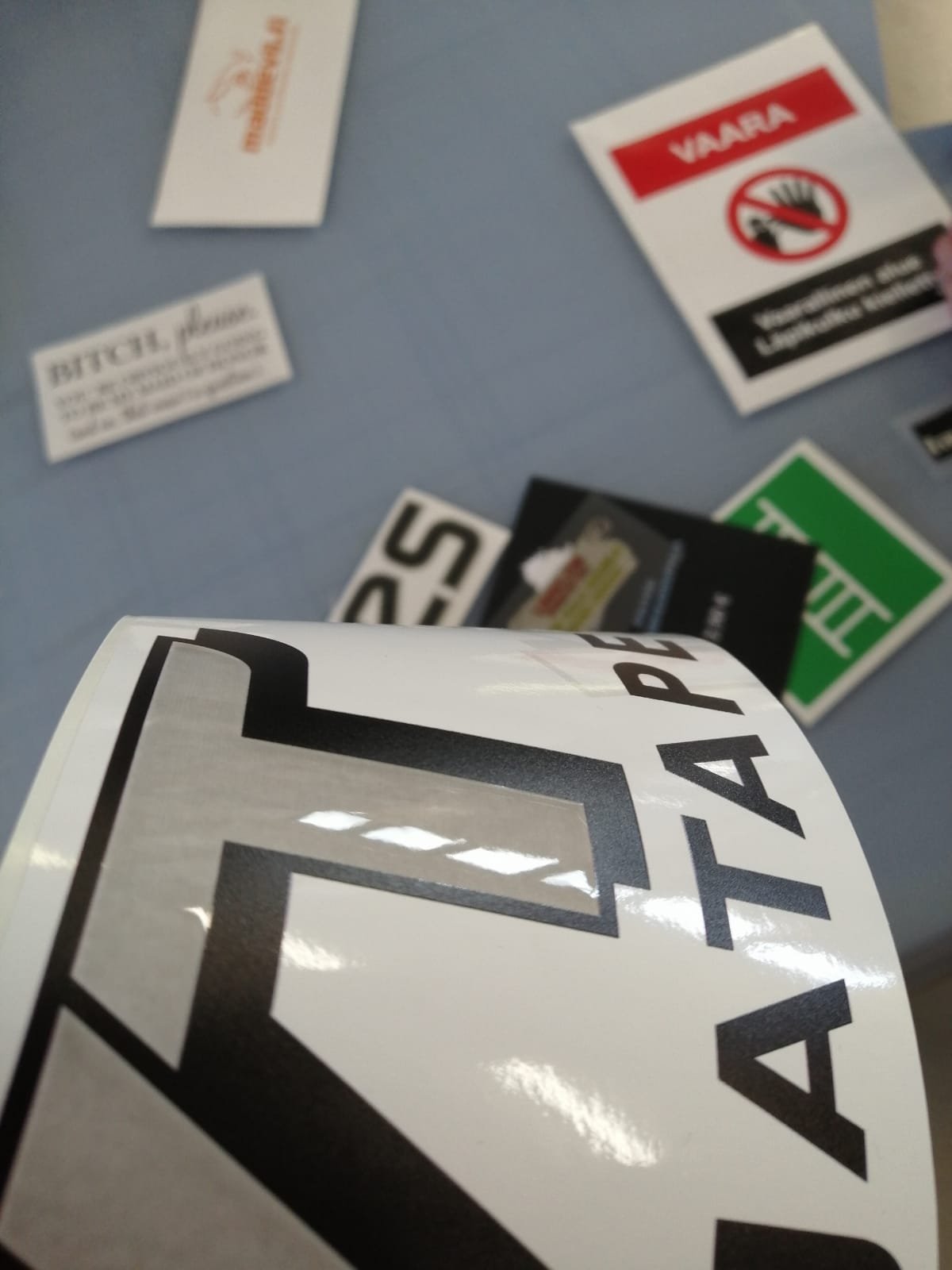
Material studies were made for the logo system to be used as a critical part of the branding system. This included choosing the gloss, thickness and finish of the chosen logo bodies. The final decision was for a glossy slightly elevated round-edged logo stickers to be used as it was the best overall fit for the ever so changing and complex machinery systems. The placement of the logos on the machinery used the logo safety area created early in my thesis project.

06 final results
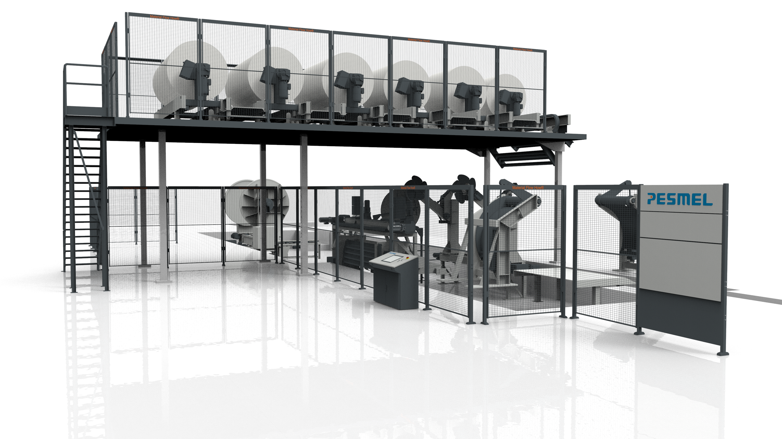
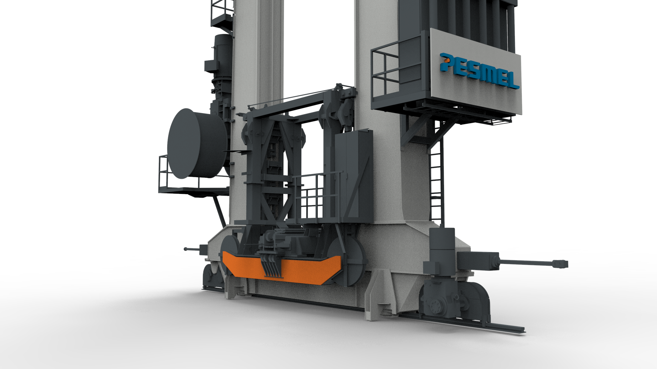
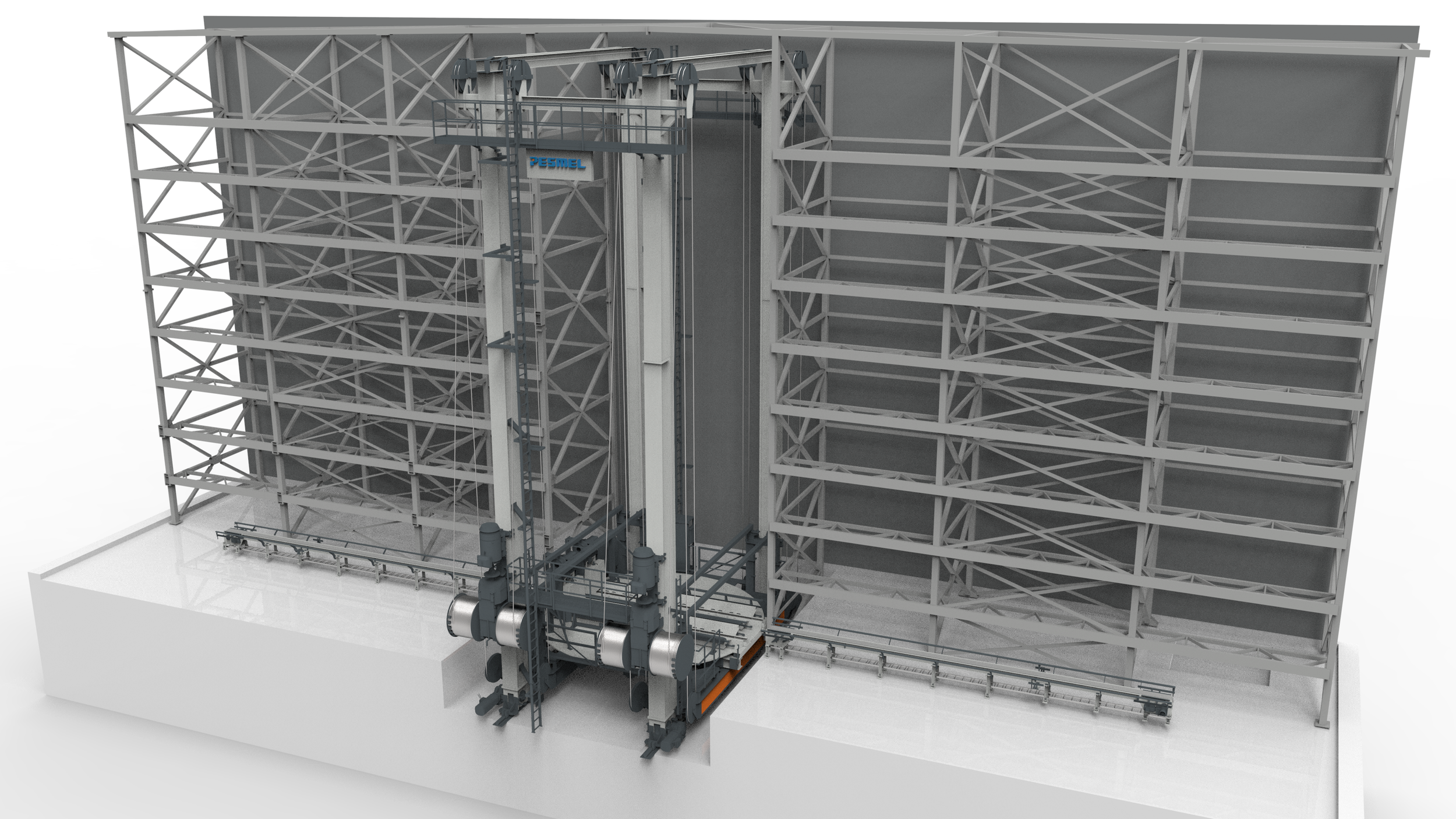
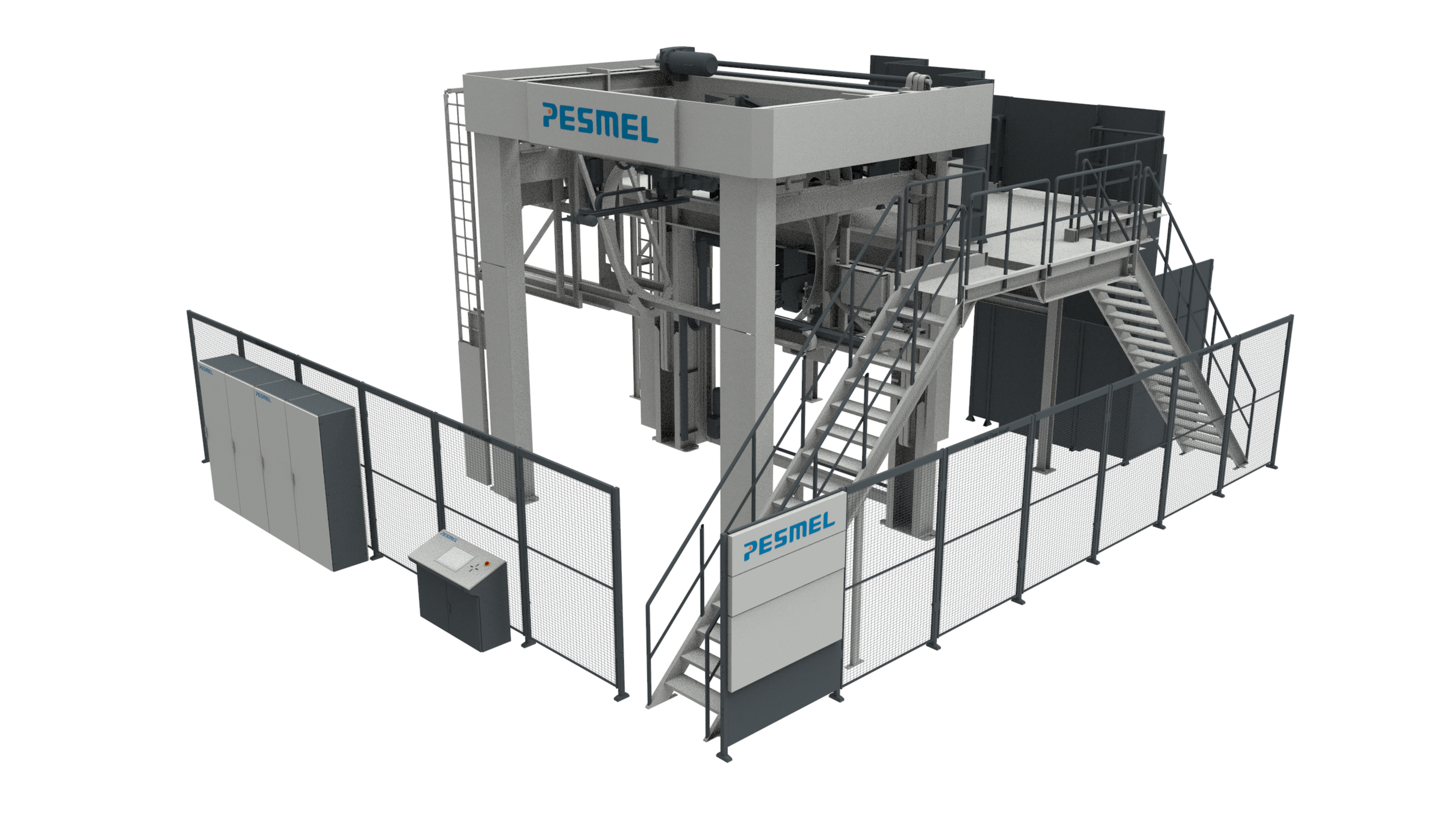
The project resulted in a developed visual design direction and product family concept that established a framework for future machine designs. During my time on the project we managed to create the main brand look for the machinery so that they could be a cohesive product family regardless of where globally they are being shipped and installed at.
The project continued internally with the engineers as they mapped every structural component to which catergory of an element they belonged so that correct CMF system would be applied to them.
07 outcome and reflection
From the moment I first sat down with representatives from Pesmel to assess the state of their product design only to find that there was, in practice, very little product design direction to the point where we created a strong design direction that could serve as the foundation for a distinctive visual identity representing their products, we came a long way.
What we learned together was that industrial machinery doesn't have to choose between functionality and recognizable design.
technical products can have a strong personality
Existing automatic warehouse systems
Benchmarking Prima Power
Choosing final logo finishes