

Building an identity
Putback basketball
01 project overview
The concept was to create a modern and an interesting brand where design visions connect with professional basketball environment.
My brand vision was to combine the city of Turku, a modern look and a touch of retro together for an interesting yet elegant entirety.
Overall the Putback brand we created offers news and publicity about Korisliiga through social media posts and training camps. The project focused on creating a distinctive visual identity and exploring how the brand could come to life across digital and physical touchpoints.
Role graphic designer
Focus brand look and communication
Client Putback Basketball
Deliverables creating a visibility for the brand
02 the challenge
The starting point was to create a brand that people would actually be interested in. The Finnish basketball scene lacks visibility and a strong visual presence, and that was the problem I wanted to address. How can you build a concept that is genuinely engaging, while also making sure it looks good?
Recognition
Create a logo and an identity that are immediately recognizable.
Capture the energy and personality of basketball without relying on generic sports aesthetics.
Culture
Build an identity that works equally well on a social media postand on physical applications such as apparel.
Flexibility
03 digital sketching
I explored multiple styles of initial logo variations. The brand needed to communicate an interesting and an energetic feel through the logo the moment somebody saw it for the first time. It also needed to be simple yet clean enough to work in today’s digital world where screen sizes vary a lot. This was the building base of the digital sketching.
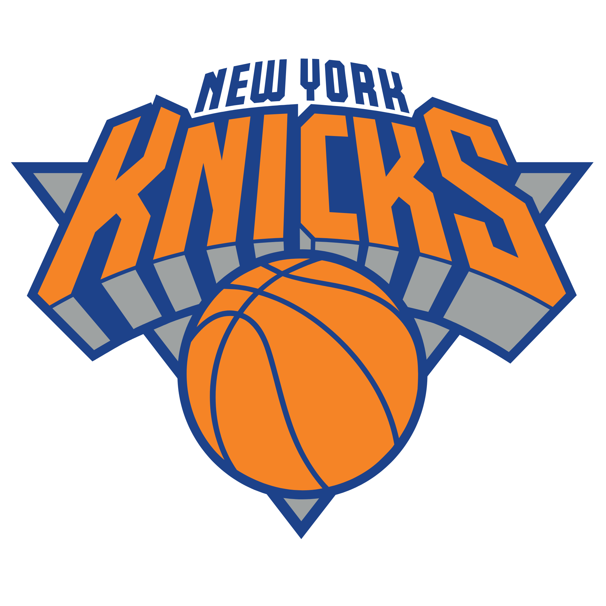
During my benchmarking one logo stood out for me as a great inspiration for what kind of a vibe I wanted the logo to communicate. Simple enough to be easily scalable yet complex enough to catch the interest of the spectator.
This logo was from the New York Knicks.




04 visual direction
typography
coloring system
05 finished logo
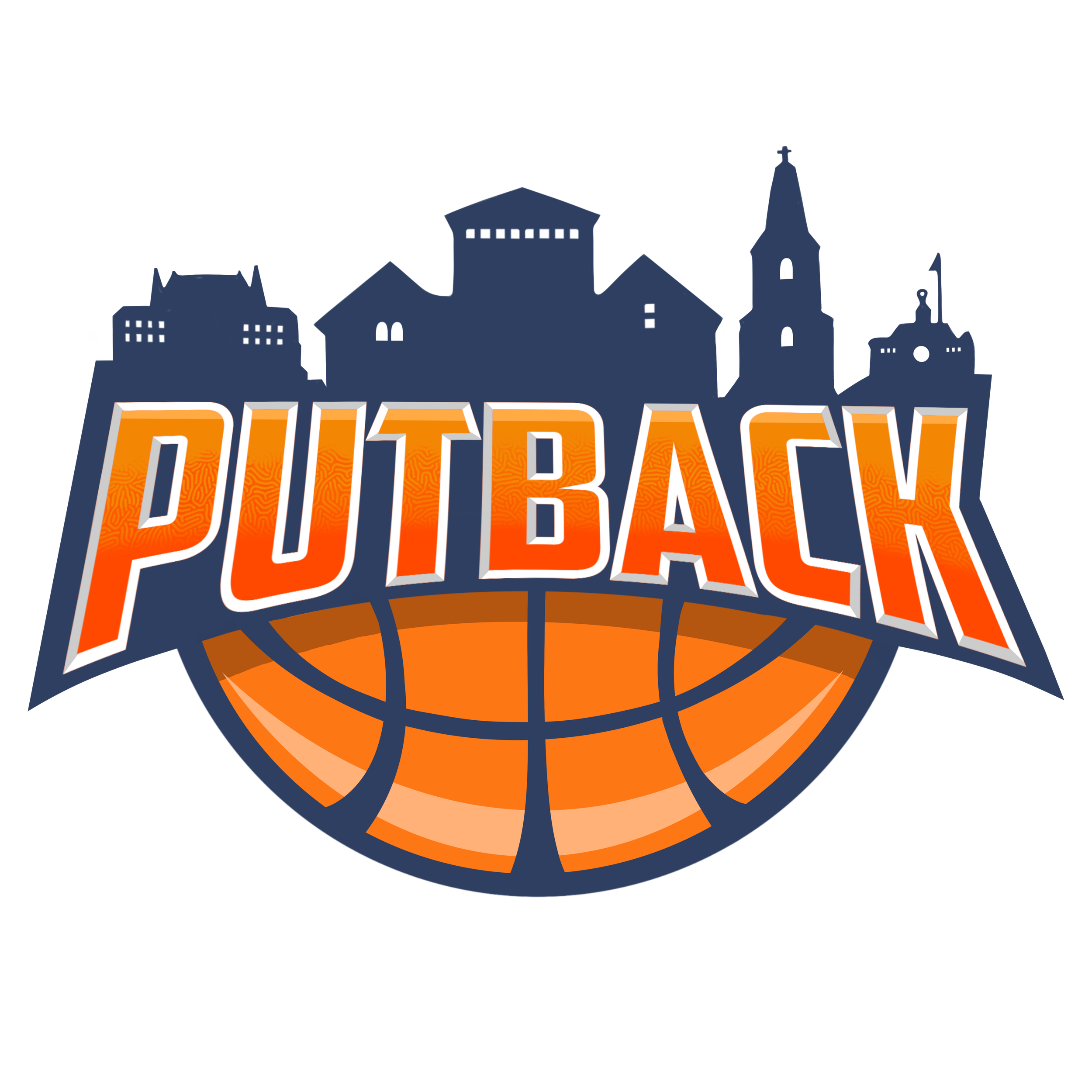
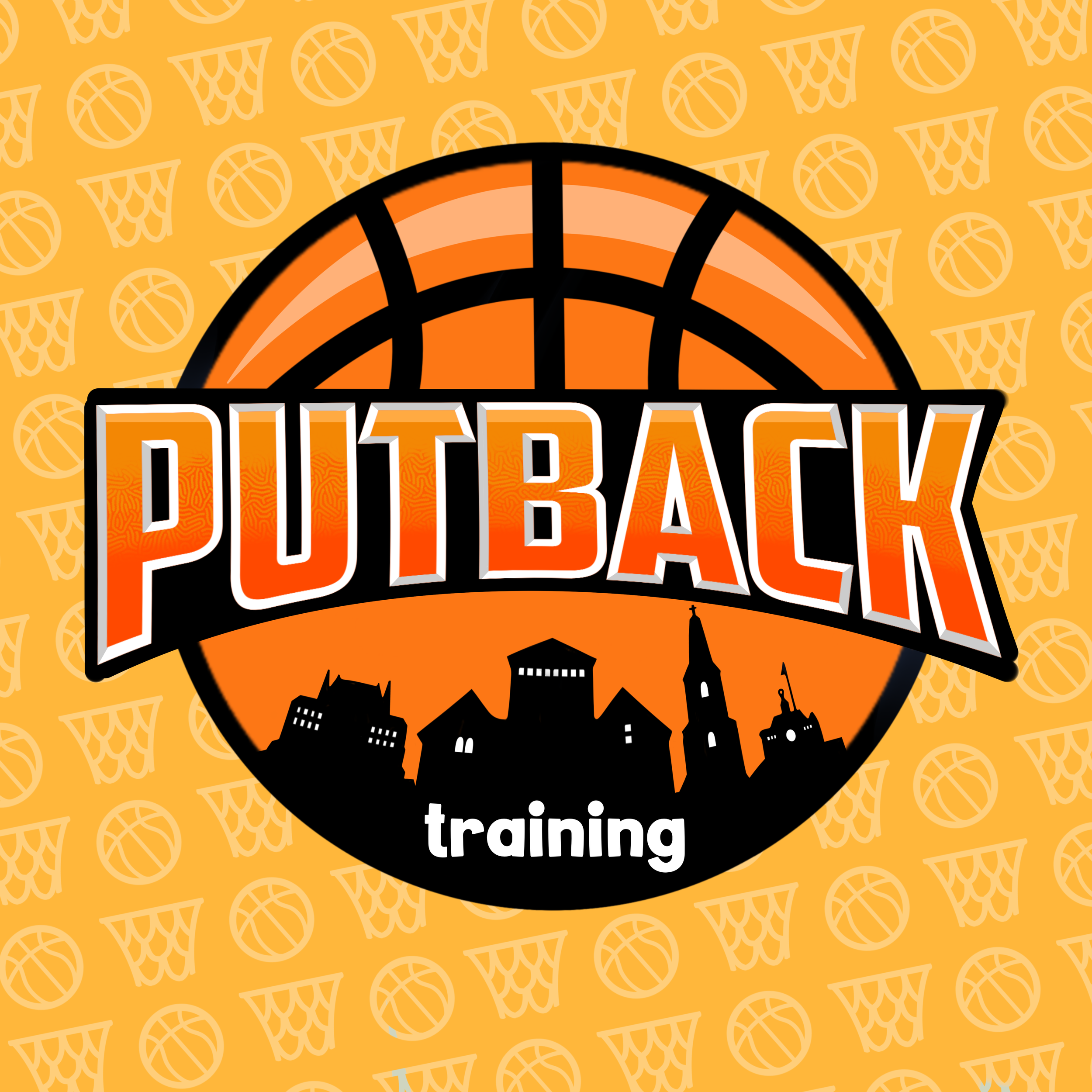
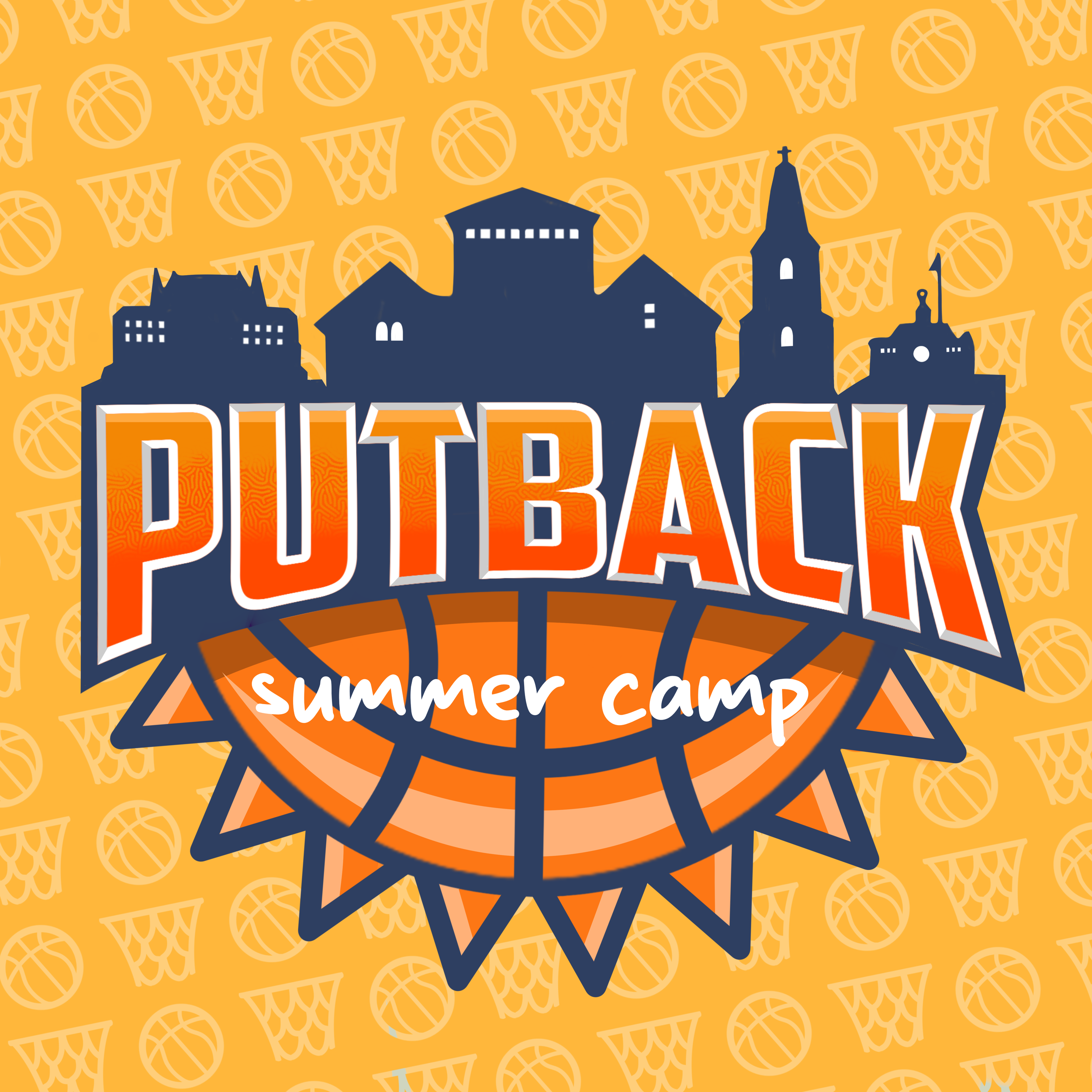
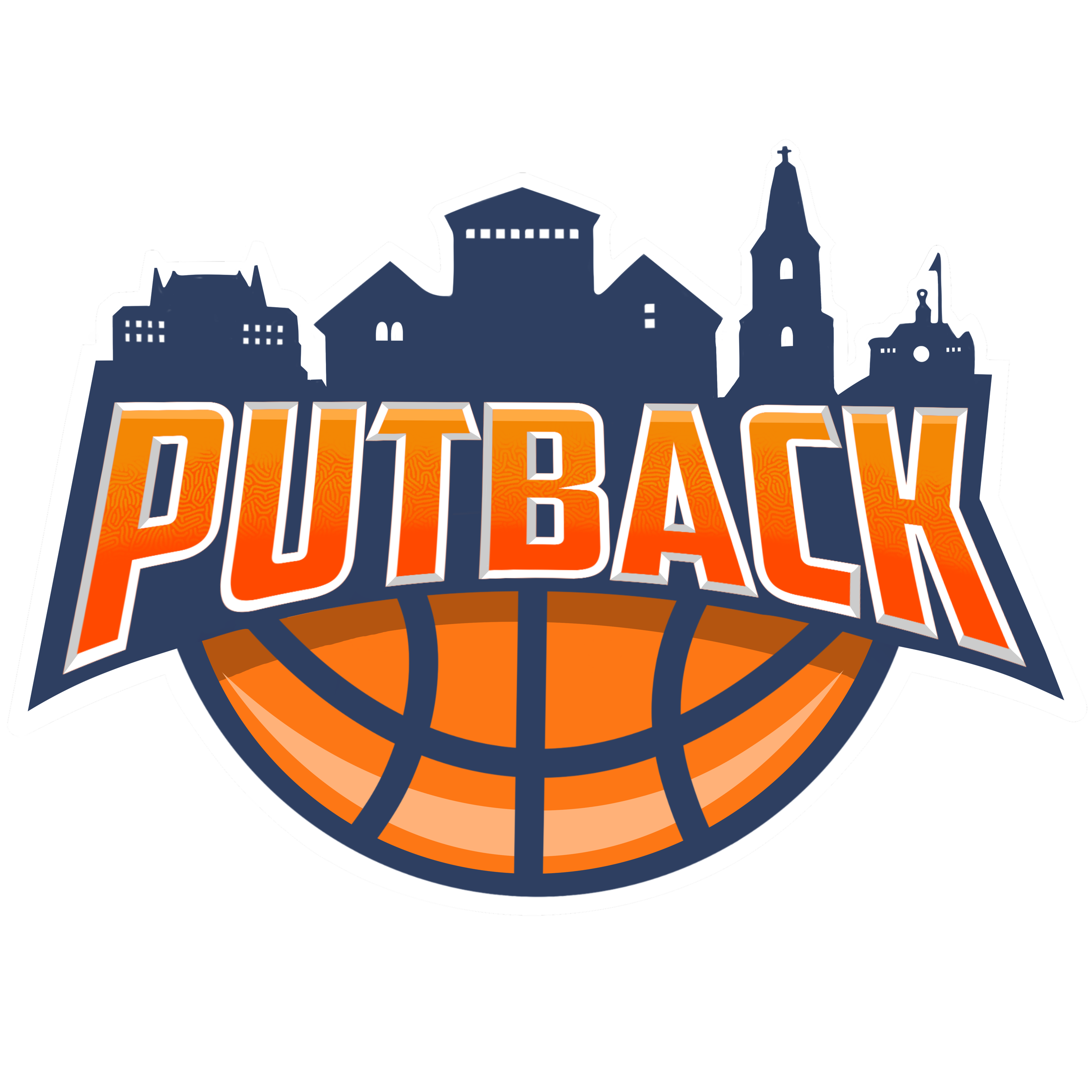
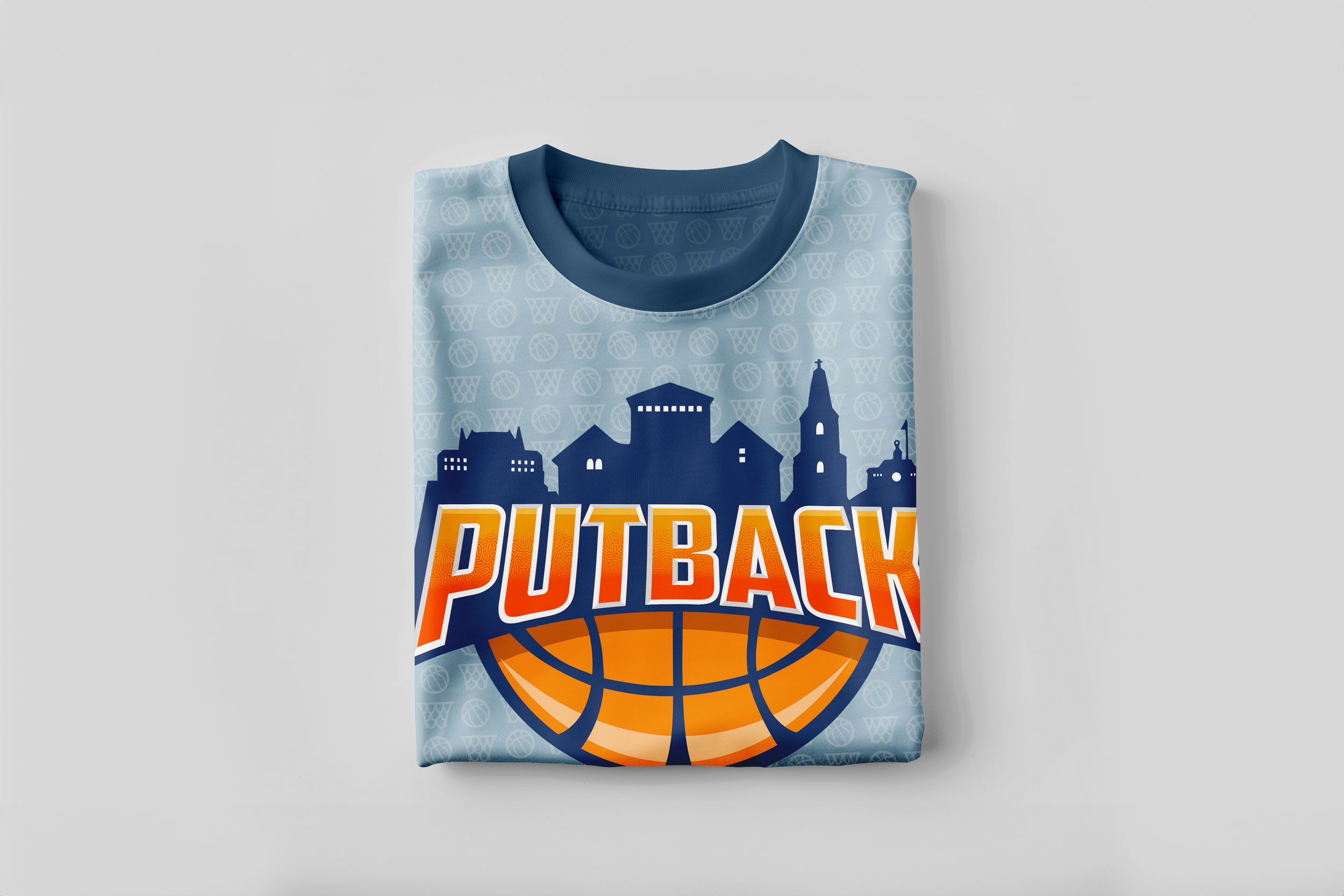
The finished logo along with a white protective border variation combined together everything that we prioritized. We wanted the logo to message clearly what it’s about on the first glance.
The silouette of the city of Turku, which worked not only as the location of where the brand originally started, but also as an visual design element to add an interesting detail to unite the whole logo together. The main text in the middle taking the main focus and working as a visual element and simultaneously as portraying the Putback text clearly. As basketball is the core of the whole brand it had to have a clear part of the logo. Covering the bottom part under the text it ties the whole logo together into a one clear system.
06 brand look in practice
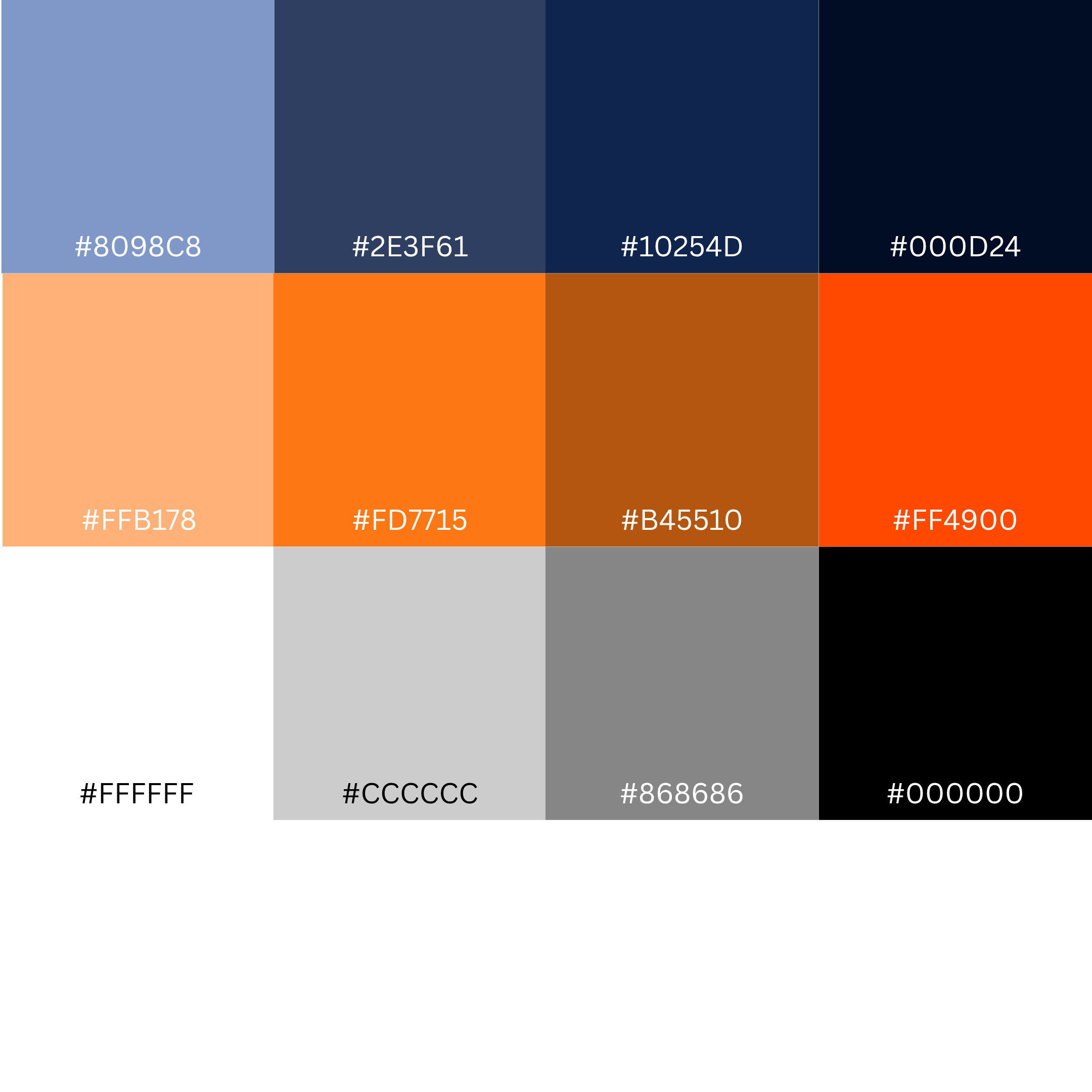
Primary blue
Primary orange
Blacks and whites
07 reflection and project outcome
A logo is just the beginning of a brand but it’s what often catches the viewers interest first. They say you can only make the first impression once which also applies to branding. When the logo creates a response of intrigue in the viewer it has succesfully served its purpose. I see the logo as the shop window of a store. If the store windows gets the customer to walk inside the store to see what they are selling then the purpose of the store window has been succesful.
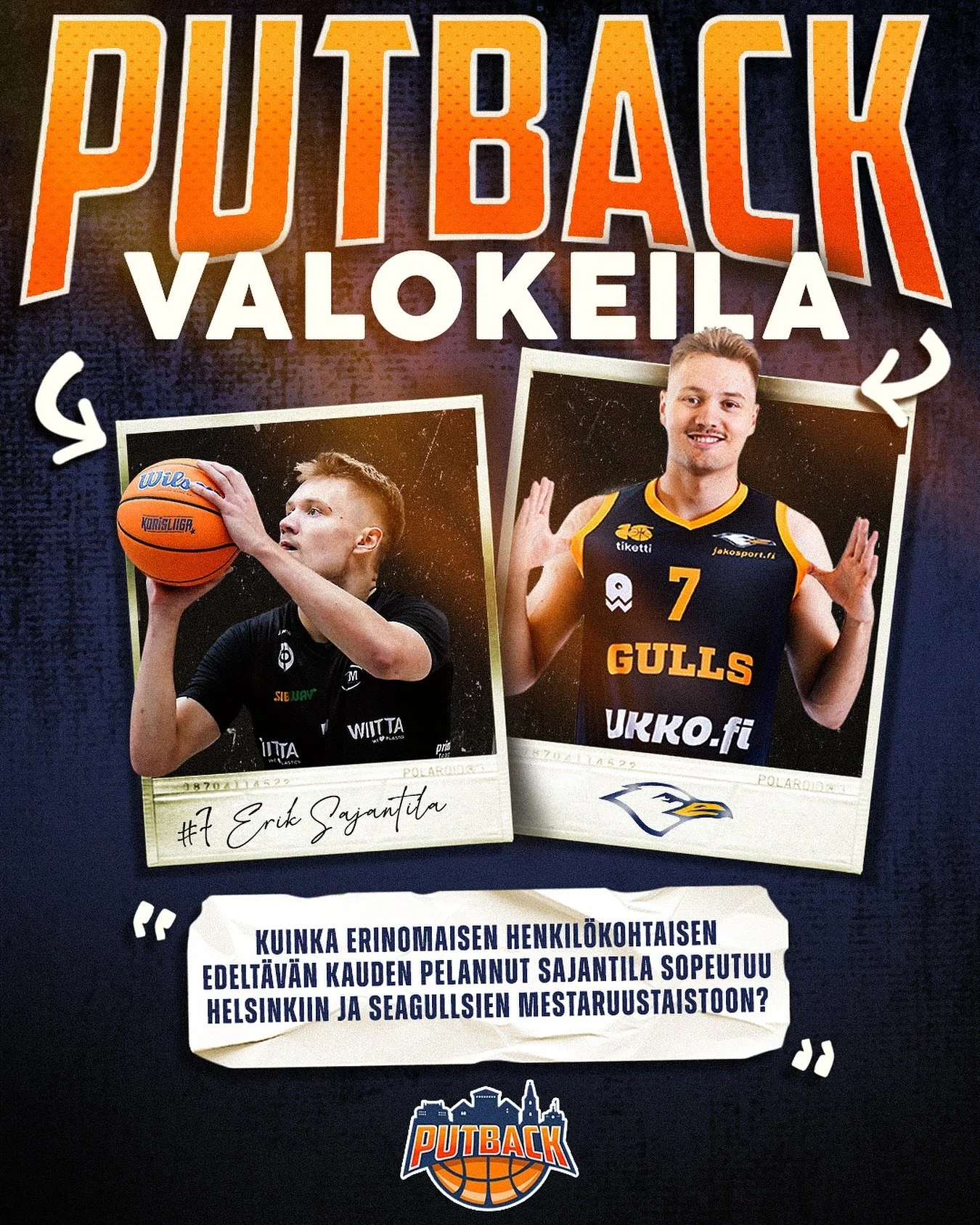
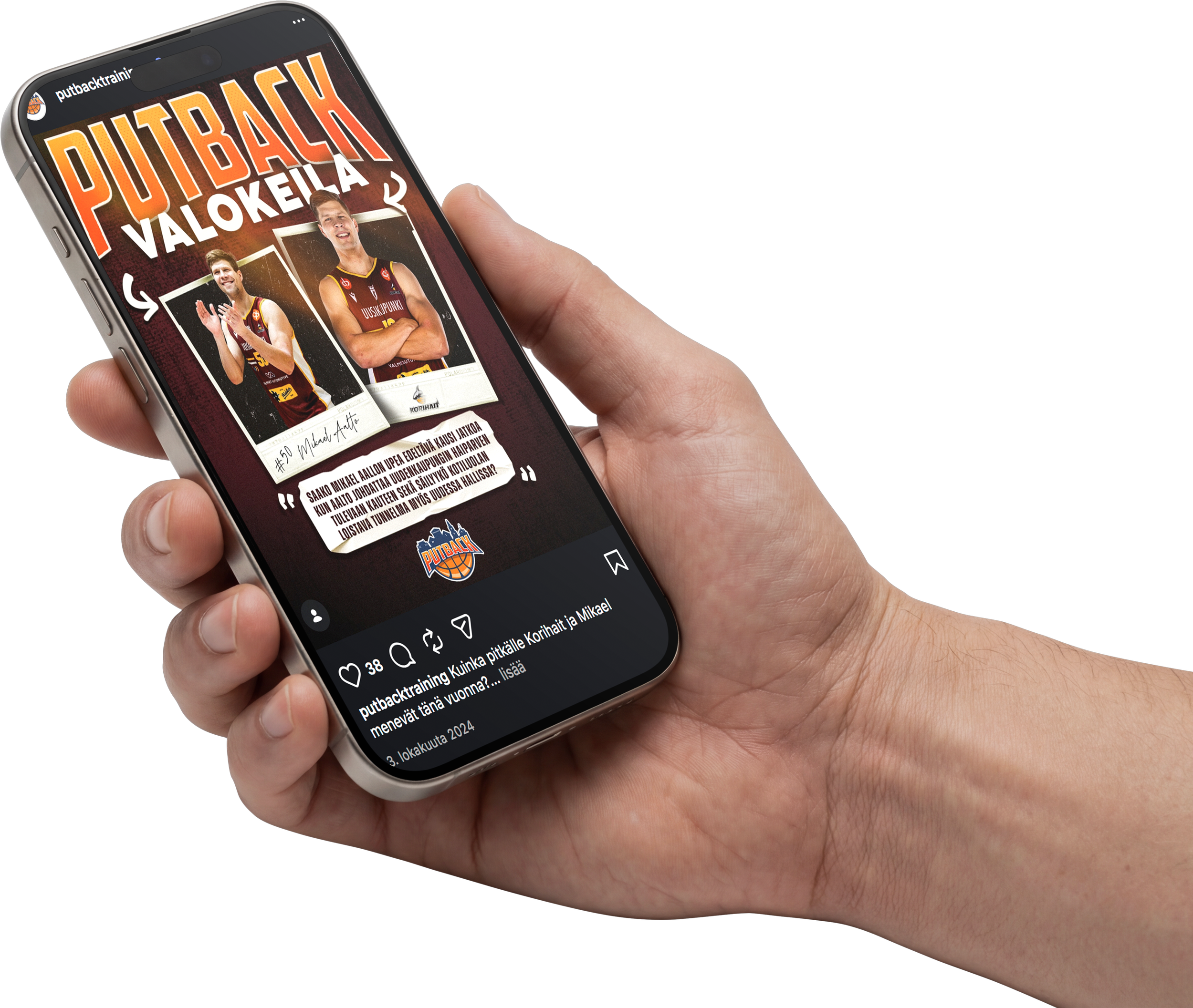
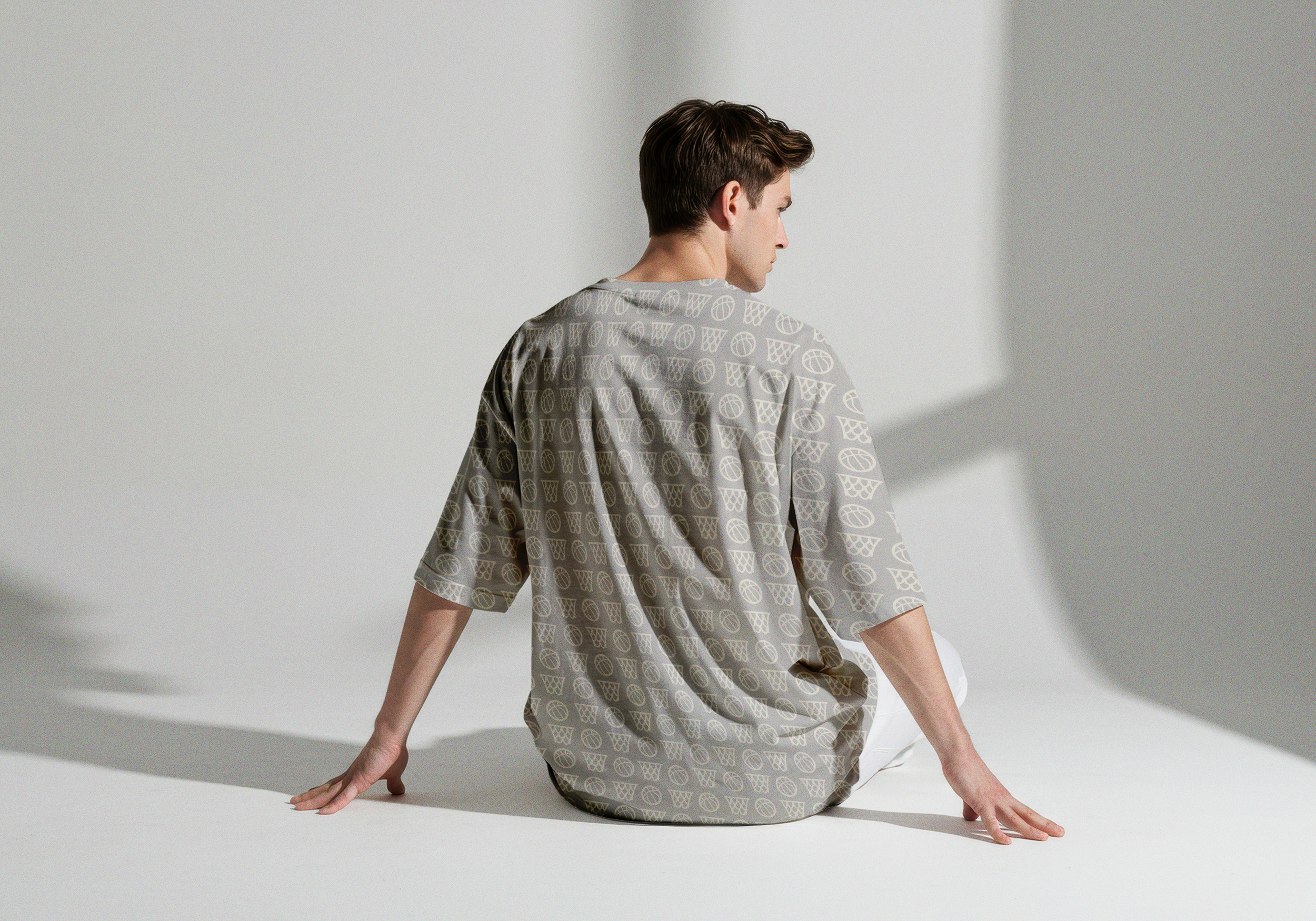
A strong brand identity is not defined by the logo alone, but by how the entire visual language comes together across different touchpoints. The logo provides recognition, while typography, imagery, graphics and composition build the personality around it. The real challenge is creating a system that remains recognizable while still adapting naturally to different contexts, from social media and digital content to apparel and physical applications.
A spark of interest
The brand gained significant visibility in a relatively short period of time. This was another example of how investing in branding and raising the overall standard of visual communication could make a real difference in the Korisliiga scene, where the level of visual execution is still too often overlooked.
Primary light
Primary main
Primary shade
Primary darkened