

Upping the game
BC Nokia
01 project overview
Role graphic designer
Focus editing and implementation of social media graphics
Client BC Nokia
Deliverables creating a new standard for social media sport graphic posts
There’s not a better feeling than being able to combine the two things I’m the most passionate about: basketball and designing. I was able to take responsibility of editing the social media posts for a professional basketball team BC Nokia in the Finnish top league Korisliiga.
I strived to create and capture the feelings of a game day through the eyes of a player. The design goal was to go beyond simply showcasing highlights or statistics. I focused on capturing the emotion and mentality of the players. I wanted to reflect the mindset of a competitor: confidence and focus.
By combining visual storytelling with sports aesthetics, I aimed to create content that felt authentic and meaningful but also to catch the interest of the viewer and stand out from the socials feed.
02 the challenge
In the modern world of professional sports, social media is one of the most visible touchpoints between a team and its audience. Succesful social media contect can at best lift the whole brand up but can at worst weaken the audiences perception of it. The challenge was to create graphics that would communicate information quickly while maintaining a strong and recognizable visual presence.
Information
Game-day content needs to communicate information immediately.
Recognition
Content needs to be identifiable as BC Nokia content at a glance.
Engagement
Graphics need to compete for attention in a fast-moving social media environment.
03 the existing identity
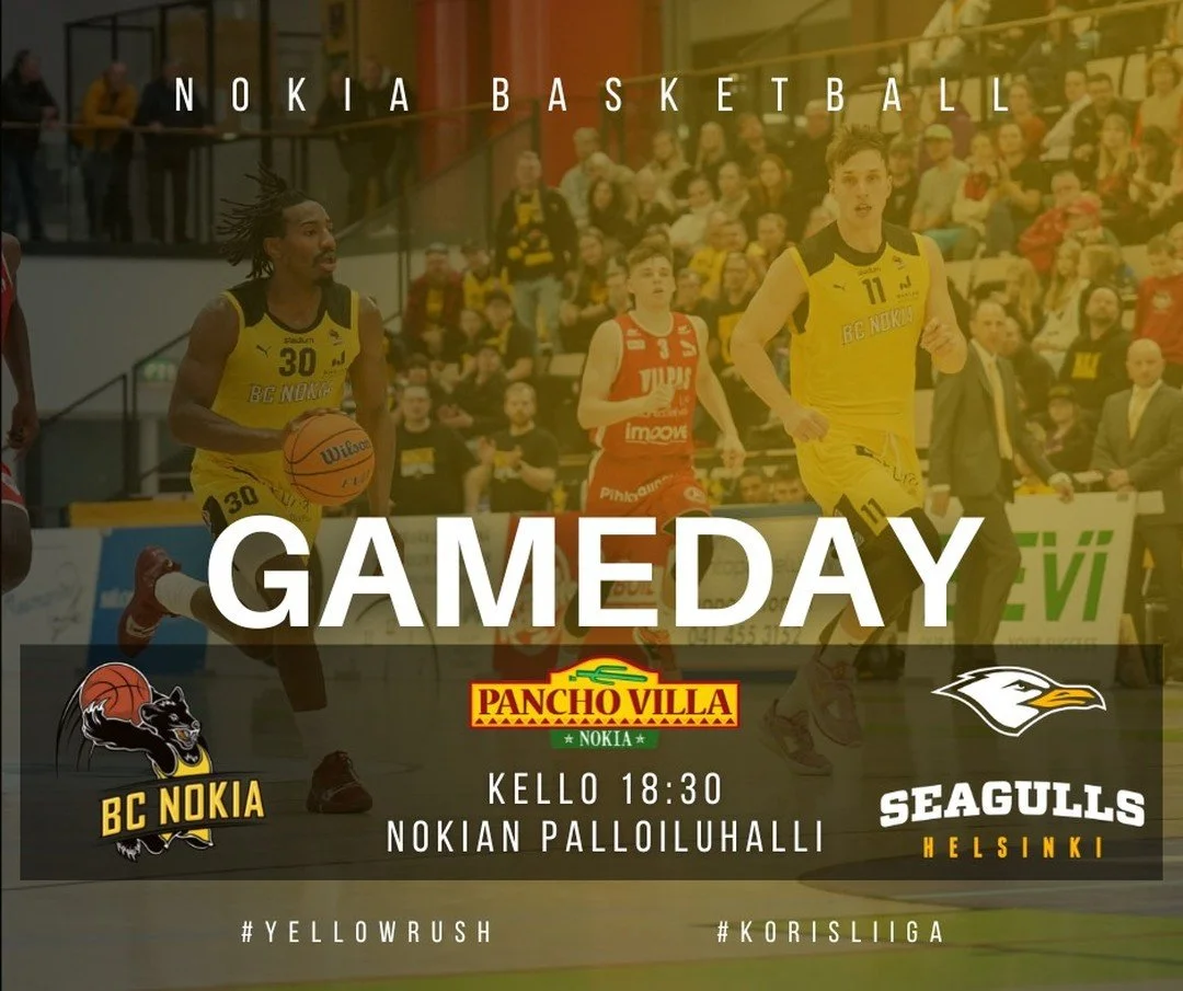
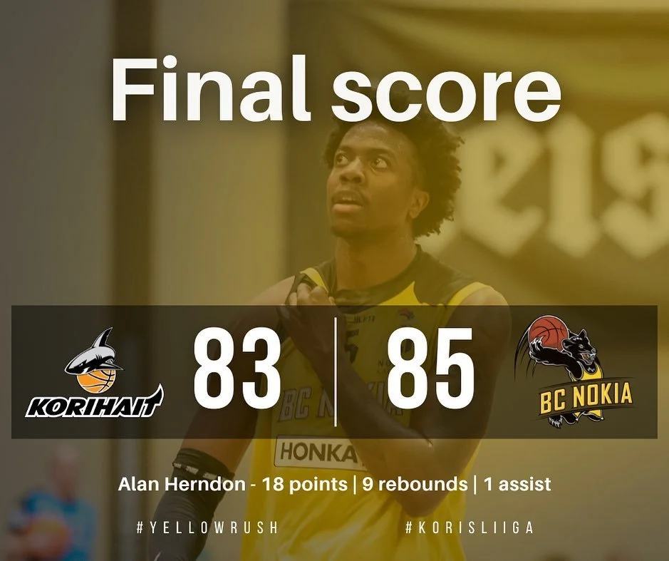
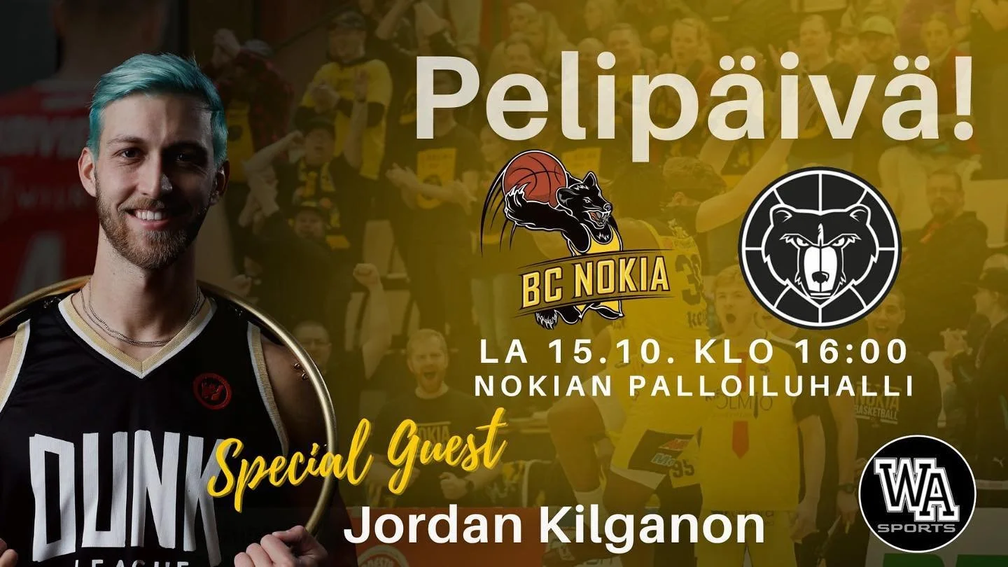
The current graphic style was bland and while it did show case the information requirement mentioned above the posts remained easily forgettable by the viewer. The lay-out, typography and overall visuals were made with bare minimum in mind, not to lift the team brand up or catch the interest of the viewer.
The team logo and a vague black and yellow theme was present but the overall visual was too uninspiring to stand out from the audiences social media feed.
04 design approach
Dynamic
The visual language should reflect the energy of professional basketball.
Recognizable
Every post should feel unmistakably connected to BC Nokia.
The graphic style should not try to hide but to stand out from the feed.
Brave
05 content system
Game day posts
Majority of the content would be game day posts and results. They needed to clearly communicate their main message and around that I could create graphics that not only fitted in but made the post feel more alive.
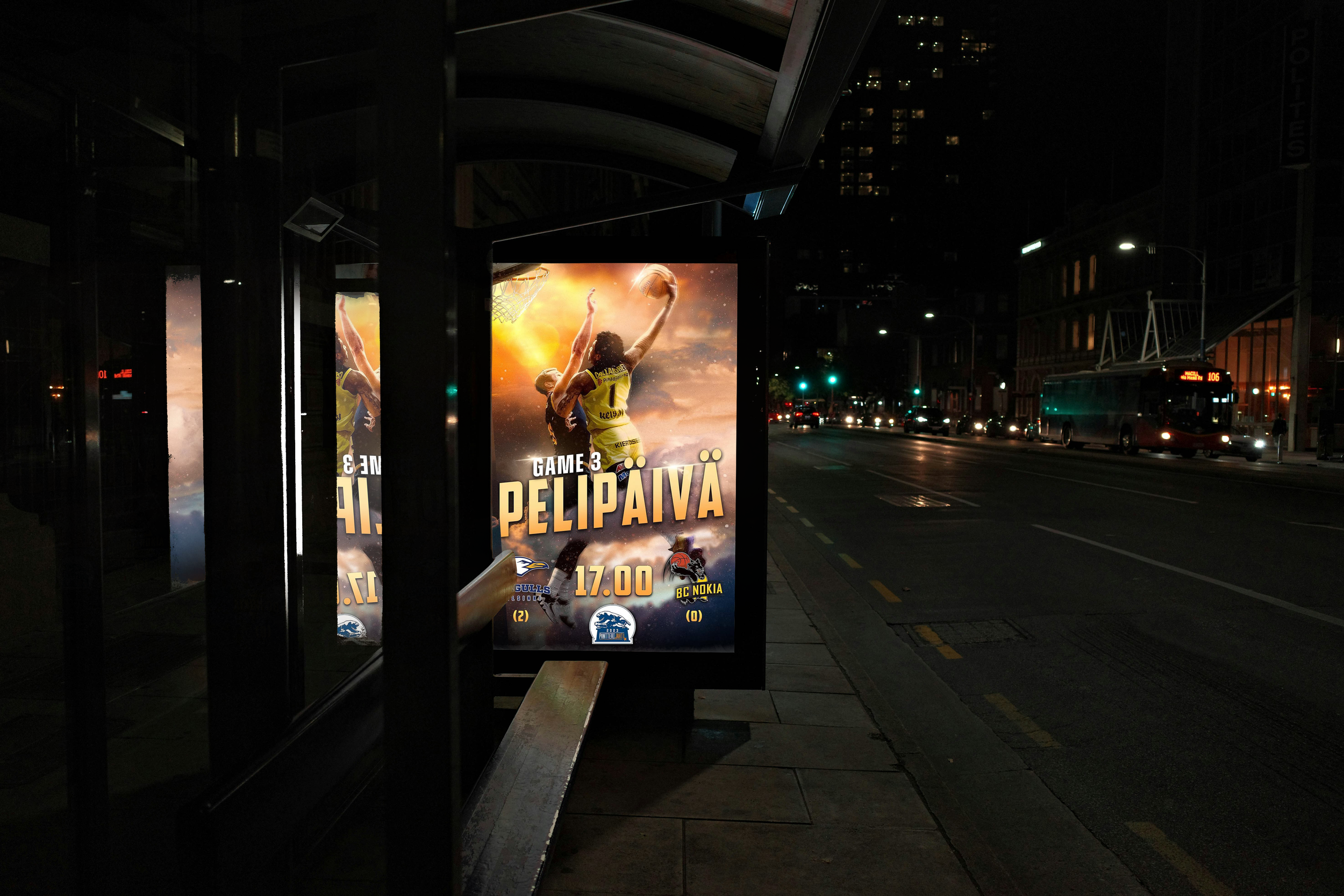
During special games such as playoffs or rivalries other out-of-the-box graphics were used to make it clear that the match ment more than just a game. I wanted it to communicate the energy of the upcoming match.
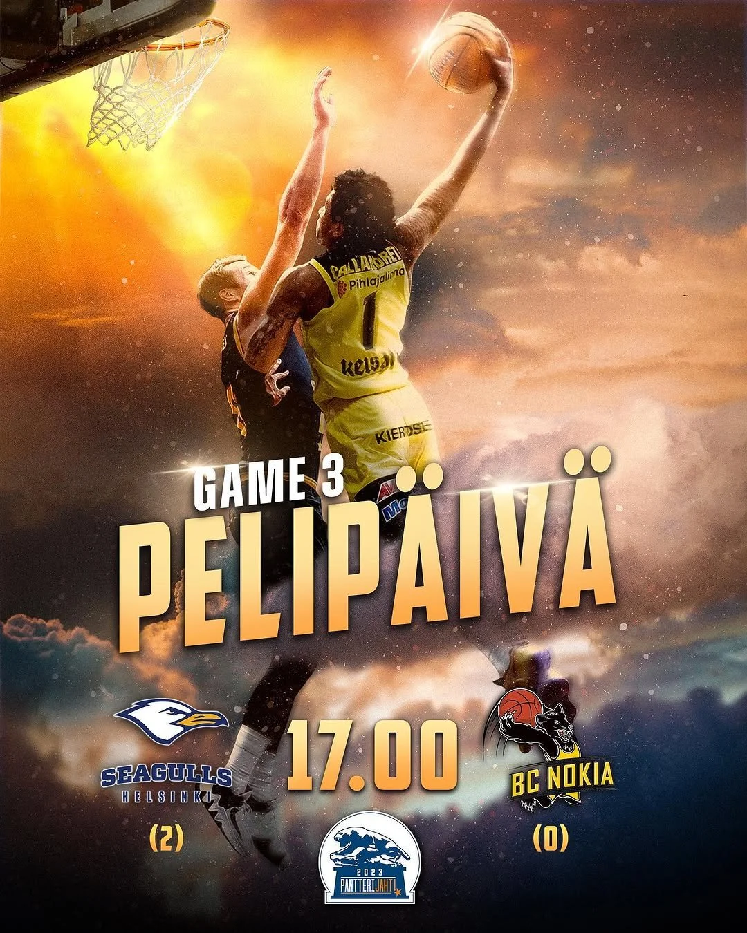
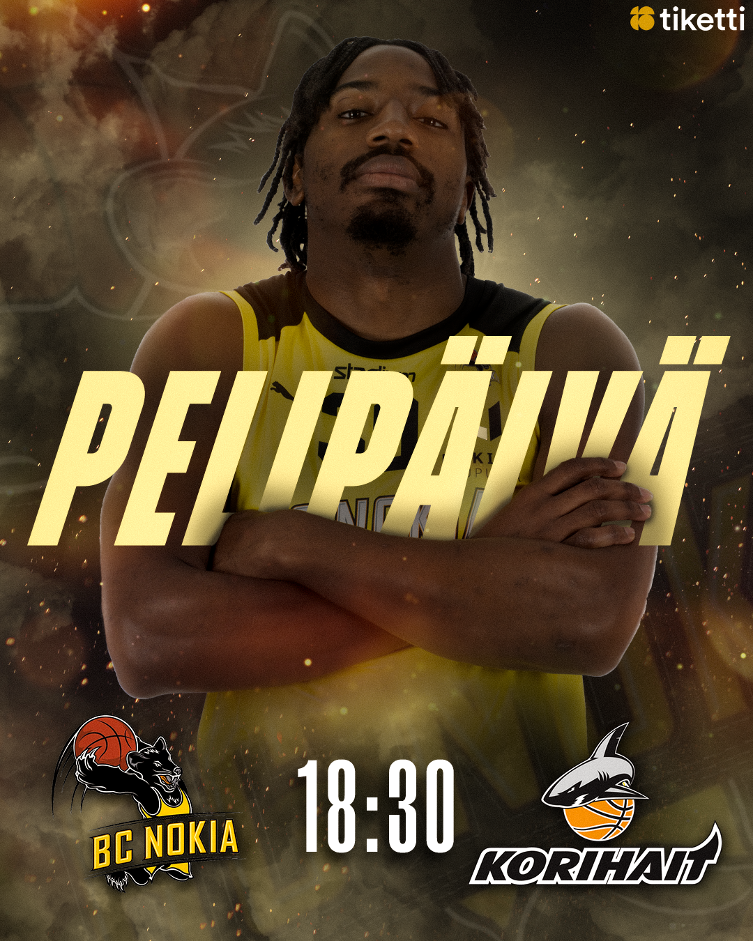
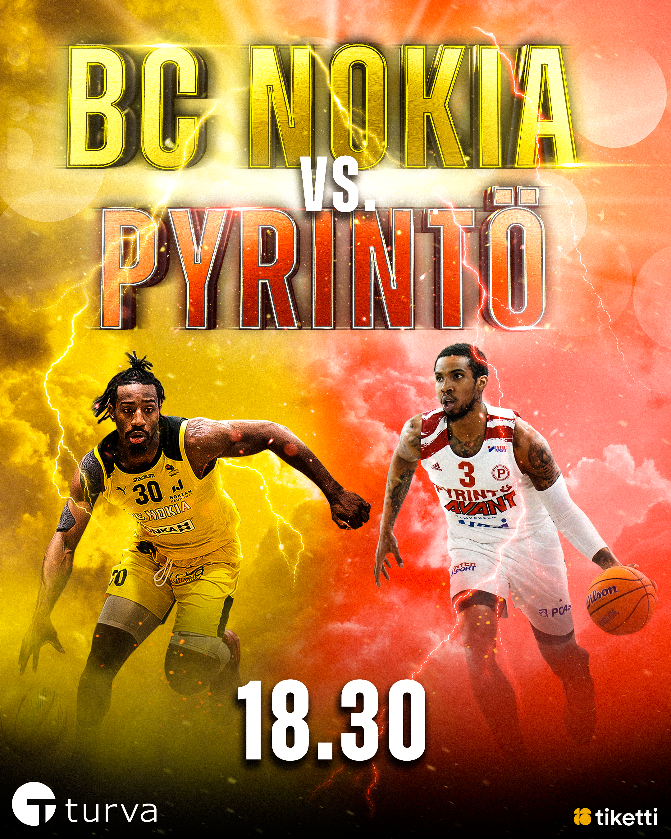
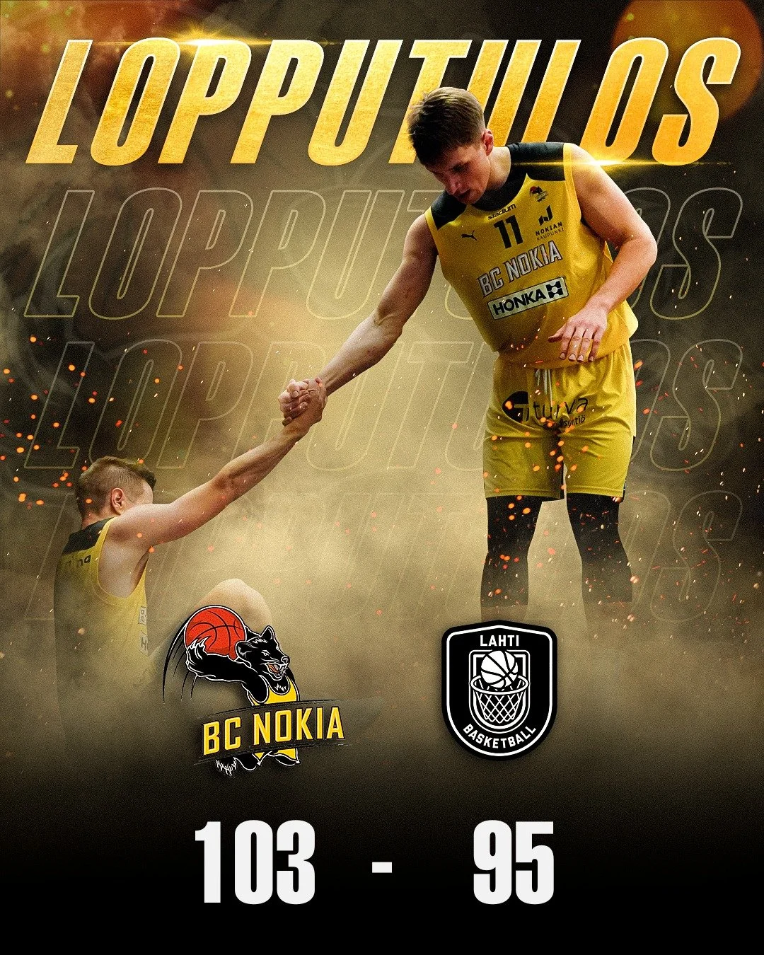
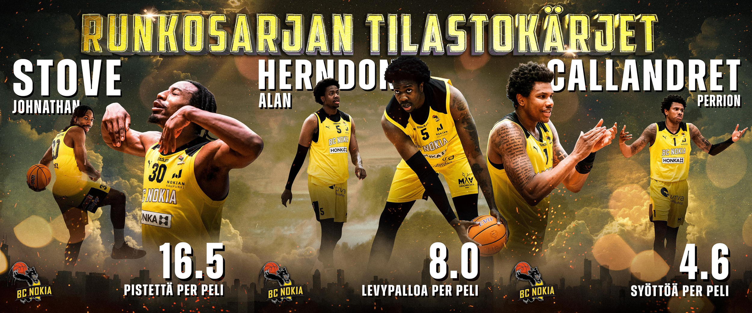
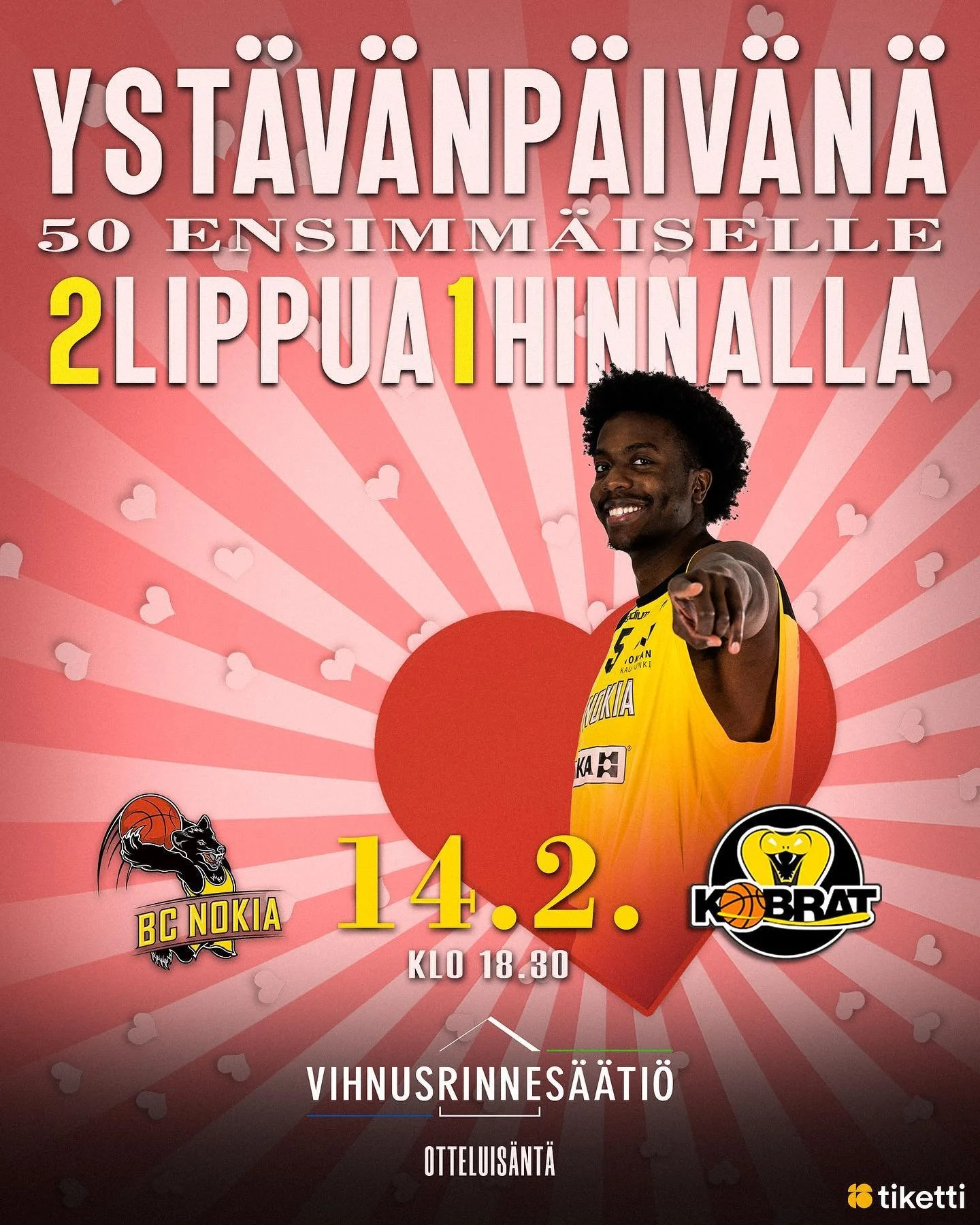
A category of content was announcements such as season leaders in specific statistics, special games such as valentines day game with an 2-for-1 ticket offer, or a thank you post for the fans.
These type of posts didn’t necessarily need to fit in the graphic system but intentionally stand out whether it’s by a slider type of a wide social media post or using totally different colors, the objective was to catch the attention of the viewer by standing out from the normal teams feed.
Announcements and special content
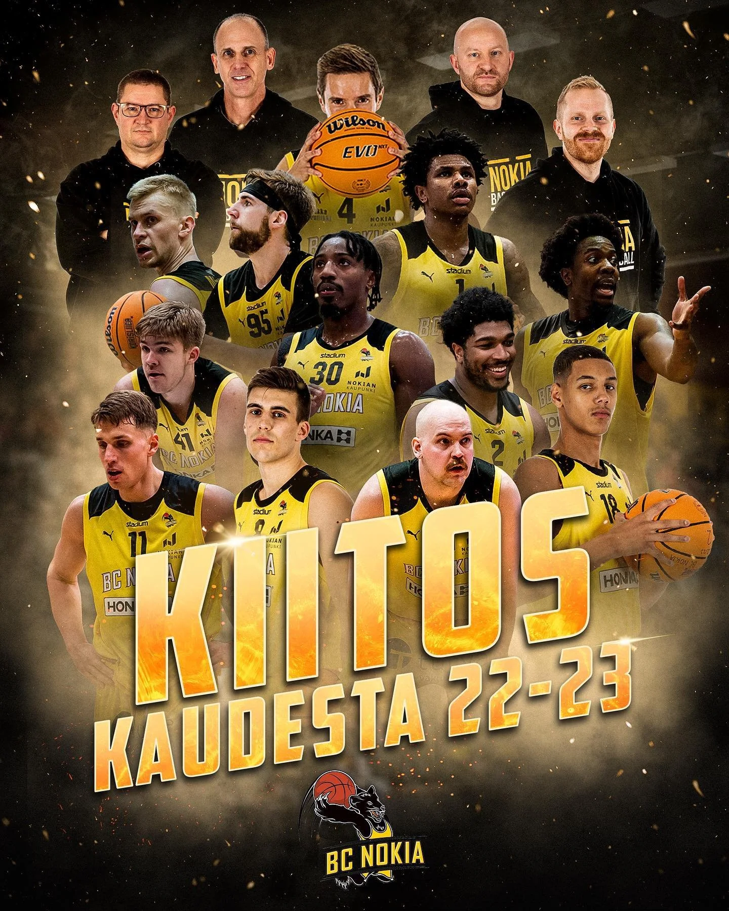
Post mock ups
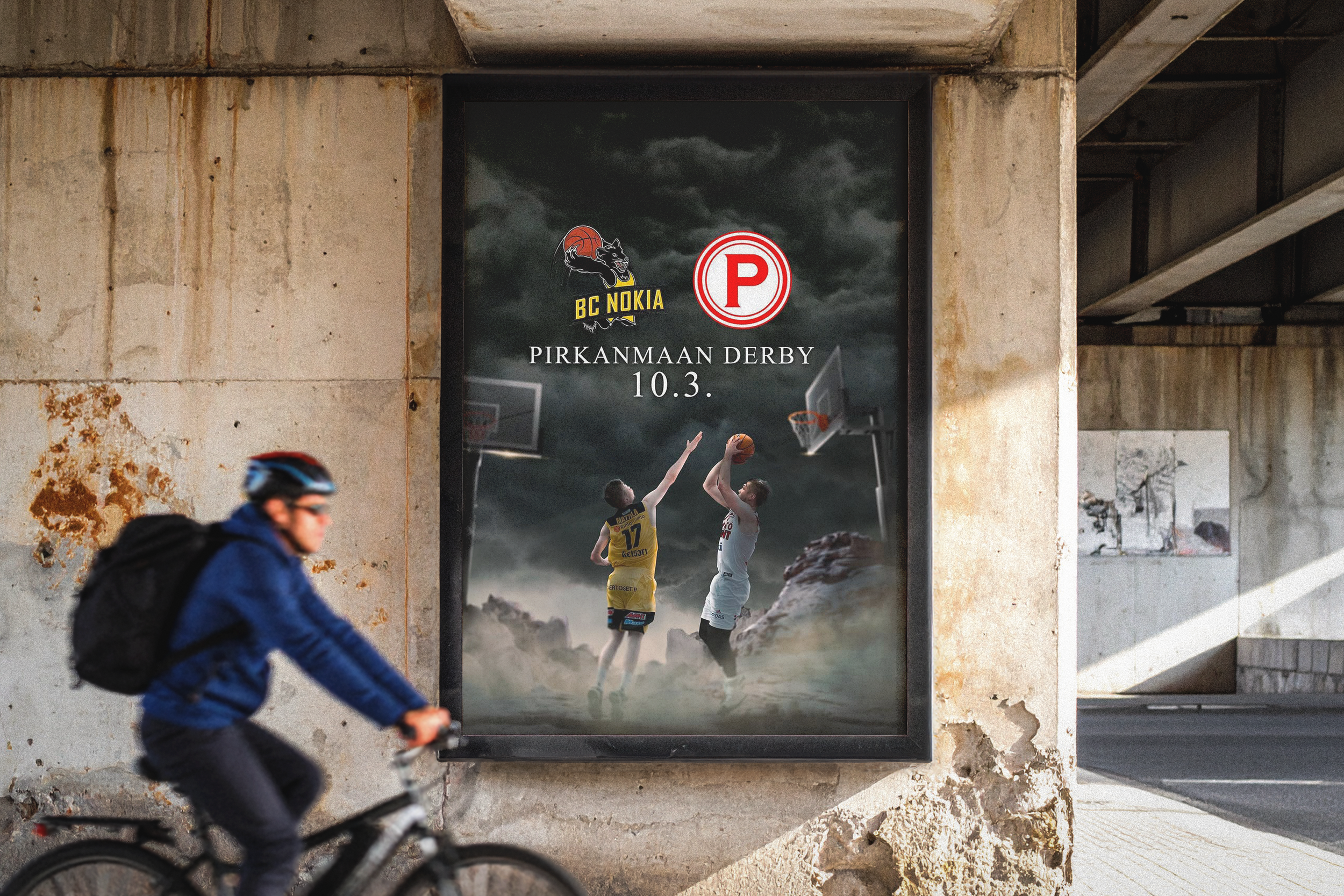
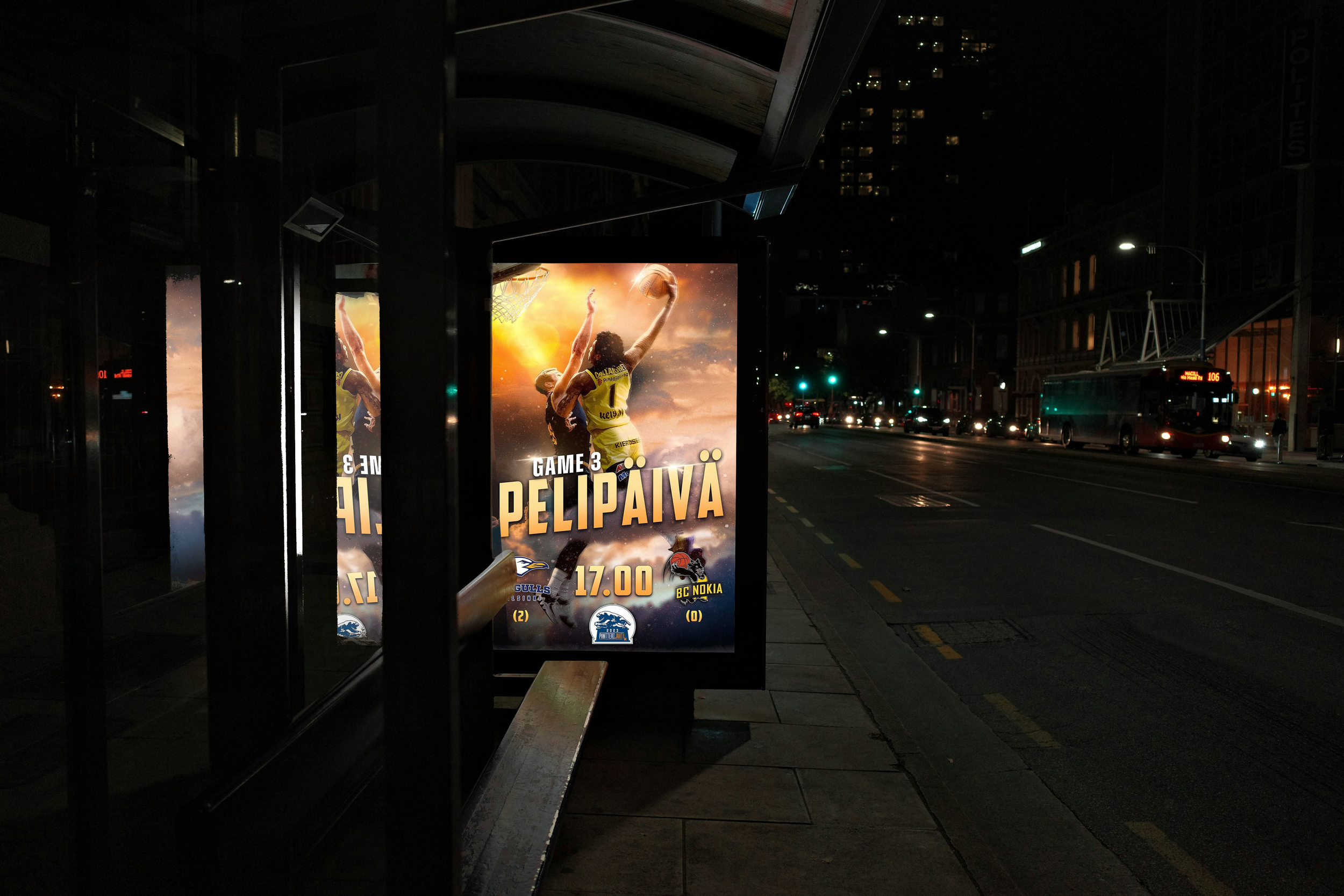
Through mock ups the intensity and the energy of the match is truly visible. Whether it was rivarlies with an end of the world type of a vibe or a highlight dunk photo in the cover these game ads would certainly catch the attention of the person walking past them.
06 Project outcome
During my time on the project the BC Nokia social media went from mediocre and uninspiring to one of the most talked about Korisliiga social media feeds. It sparked alot of comments and compliments from all over the league from fans, players and coaches alike.
The main design priorities were information, recognition and bravery. To communicate its message, to feel like a part of a bigger system and to be bold and stand out from the feed. I think those criteria were met but there is always a way to make things look better and more polished. During my time of editing and idealizing the posts I gained alot of trust in myself and my vision.
In the end sports content moves fast. The design needs to work within seconds, compete with other content in the feed and still communicate the energy of the game.