

Re-packing automotive
accessories
IKH Oy
01 project overview
Role packaging designer
Focus visual identity and retail communication
Client IKH Oy
Deliverables clear product family system
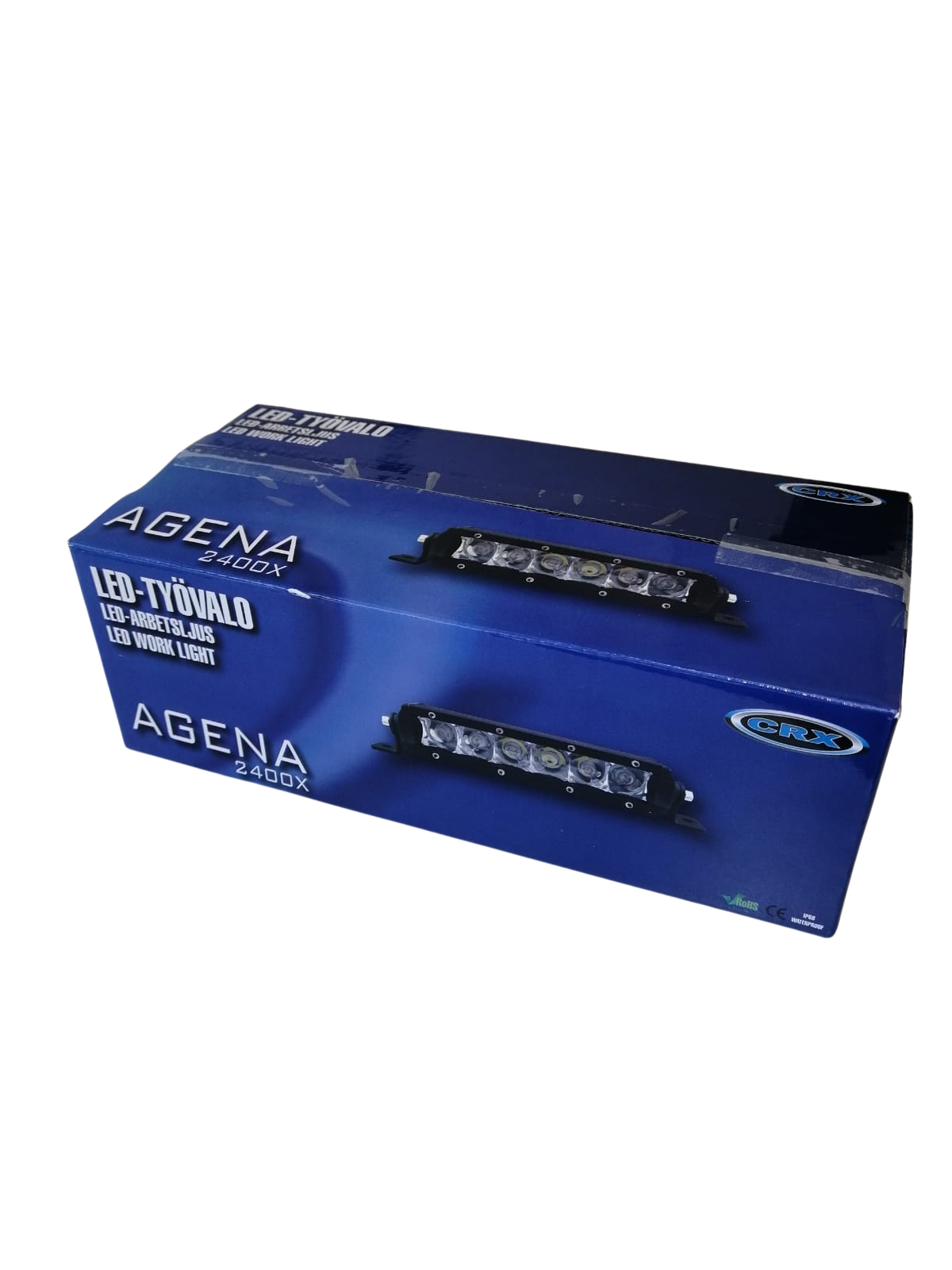
As part of a package design project I developed a new visual system for the CRX product family for automotive accessories consisting mostly of car add-on headlights. The project involved creating visually appealing packaging that effectively communicated product features while aligning with the target market.
I worked on layout design, branding elements, typography and color selection to ensure strong shelf appeal and brand recognition. The final designs balanced aesthetics with practicality, enhancing the customer experience and supporting the products' retail visibility.
02 the challenge
A retail package has only a few seconds to communicate what the product is, why it matters and who it is for.
The challenge was to create packaging that could communicate technical product information clearly while also standing out in a busy retail environment.
Recognition
The packaging needs to be immediately identifiable as part of the same product family.
Clarity
Technical information needs to remain easy to understand.
Shelf impact
The package needs to attract attention without becoming visually overwhelming.
03 understanding the context
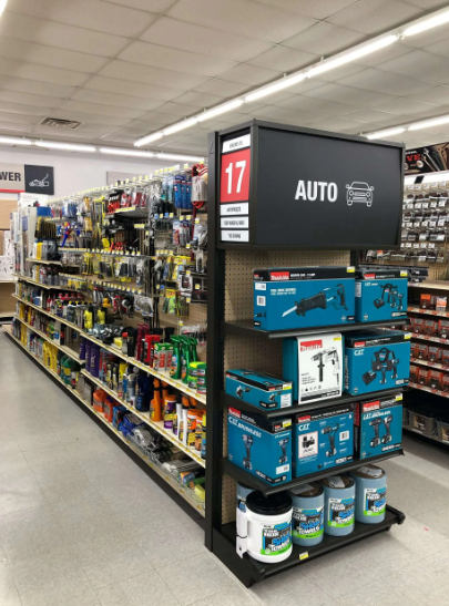
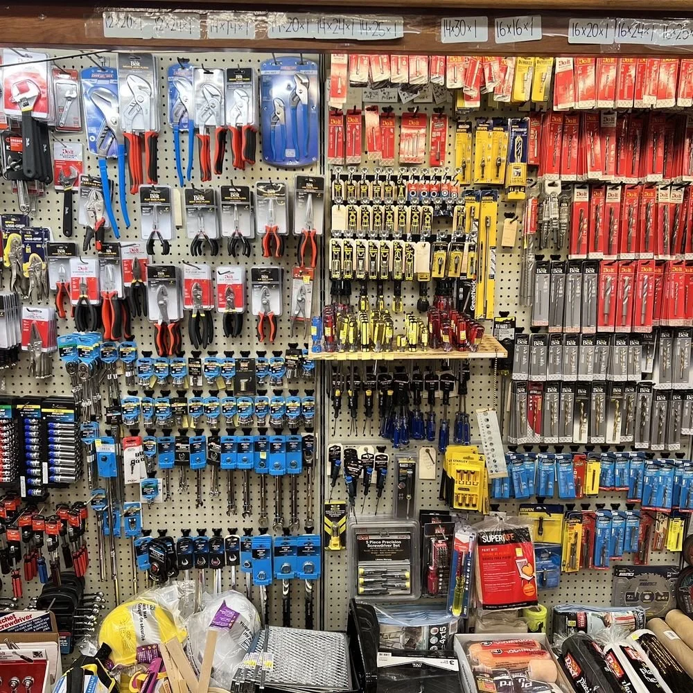
Hardware store as an environment differs alot from other types of retail store ecosystems. Here the amount of items in different sizes and colors is extremely high. The packaging needs to work from a distance, communicate at arm's length and still remain legible when surrounded by competing products.
This became an important principle throughout the project. Instead of simply making the packaging visually cleaner, the aim was to establish a hierarchy that guides the customer naturally through the information.
Function before aesthetics
A visually striking package is not successful if the customer cannot quickly understand what the product is, what it is suitable for and what they need to know before purchasing or using it.
This made clarity and information hierarchy essential parts of the design process. The visual language needed to attract attention without competing with the information that ultimately helps the customer make the right decision.
04 existing packaging
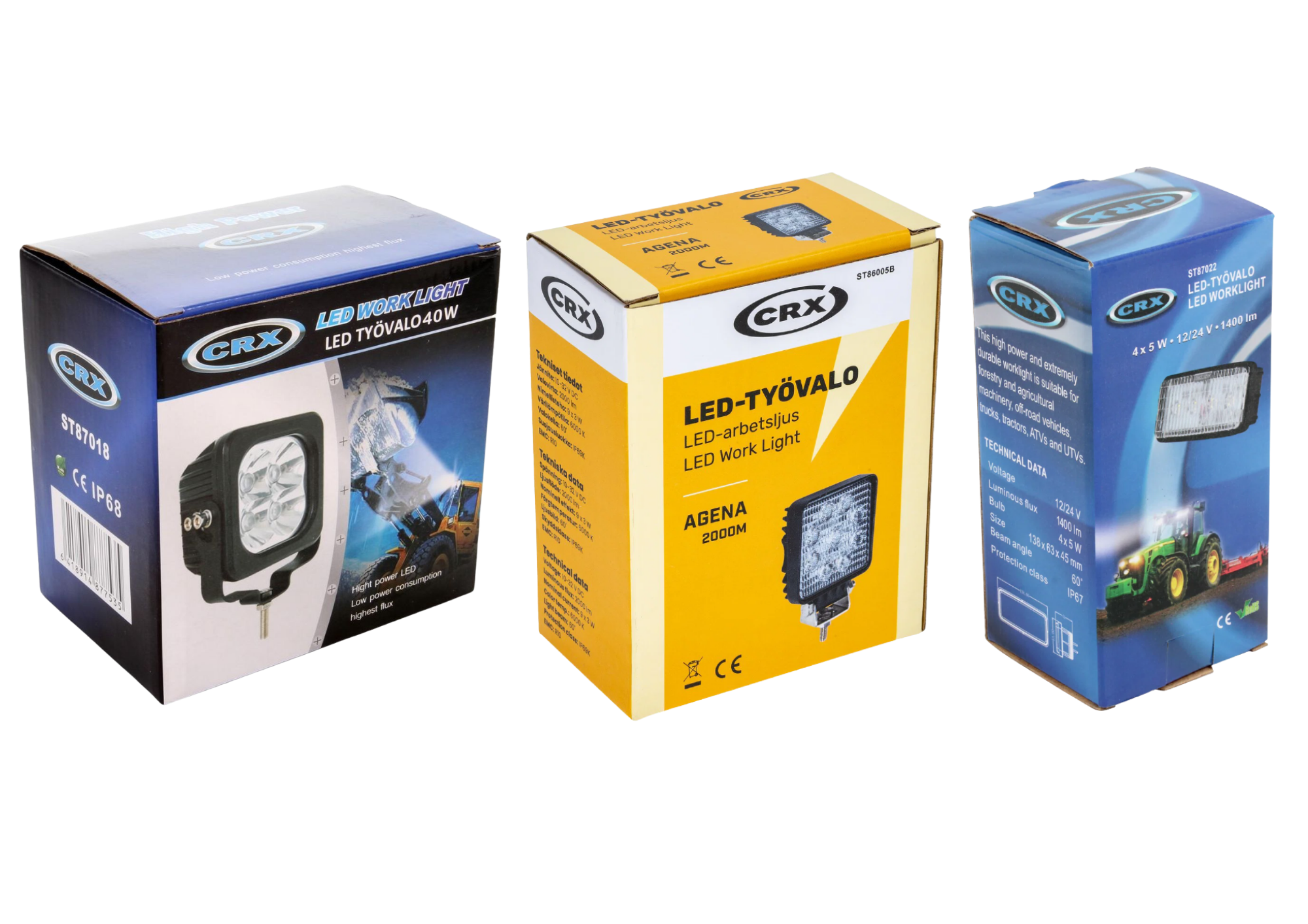
The existing packaging provided the necessary product information, but the visual hierarchy and relationship between different products could be developed further. The packages had all necessary information in them but it got too easily lost in the visual noise. In addition the packages were too far apart from each other visually and it was hard to see that they belonged in a common product family.
05 design direction
Recognizable
Different products should feel like a part of the same family.
Confidence
The packaging should communicate the quality and technical nature of the product without unnecessary visual noise.
Clarity
Information should be easy to find and understand.
06 information hierarchy
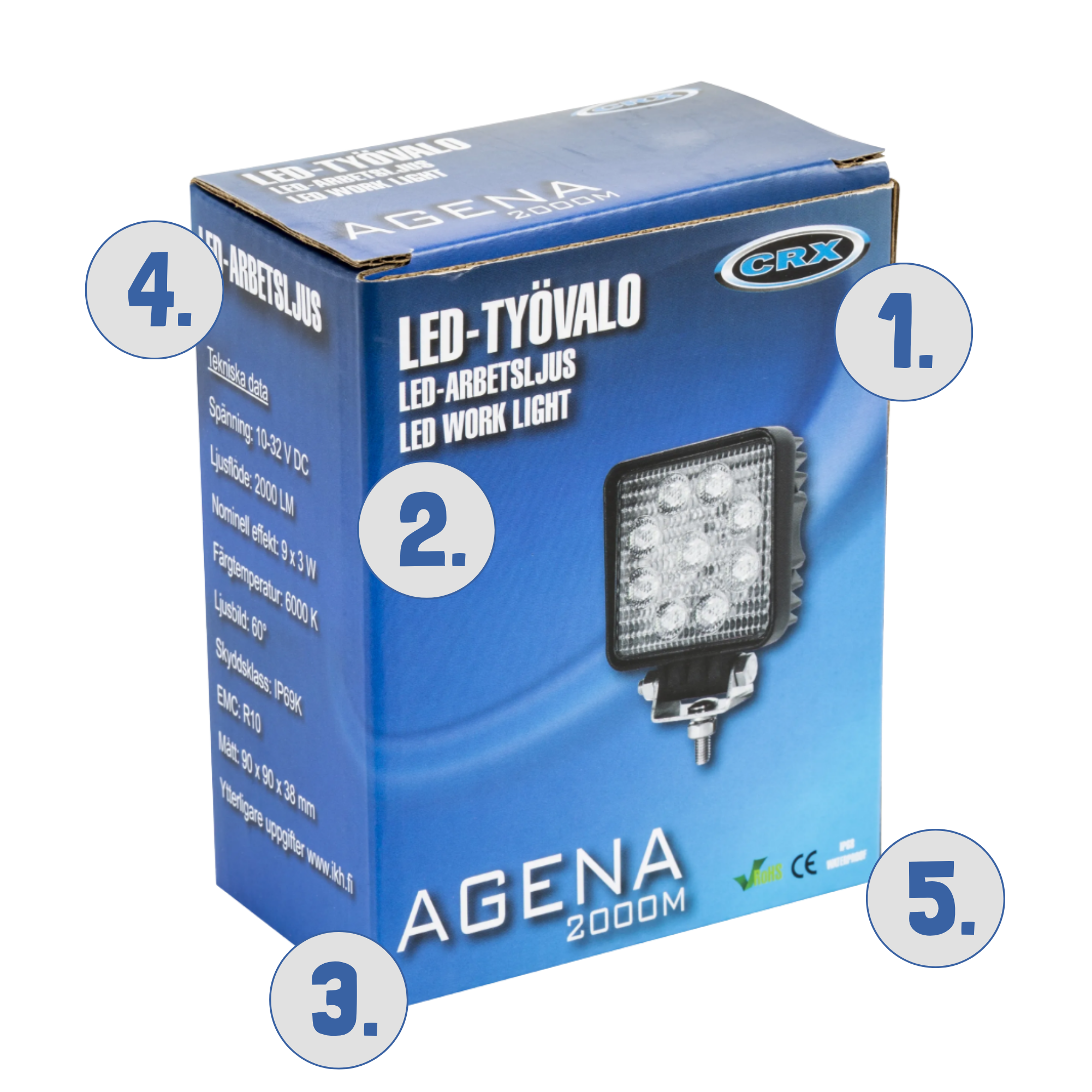
Packaging needs to communicate multiple layers of information simultaneously. The visual hierarchy determines what the customer sees first, second and third.
01 Brand
02 Product category
03 Product name
04 Key product information
05 Technical specifications
07 product family
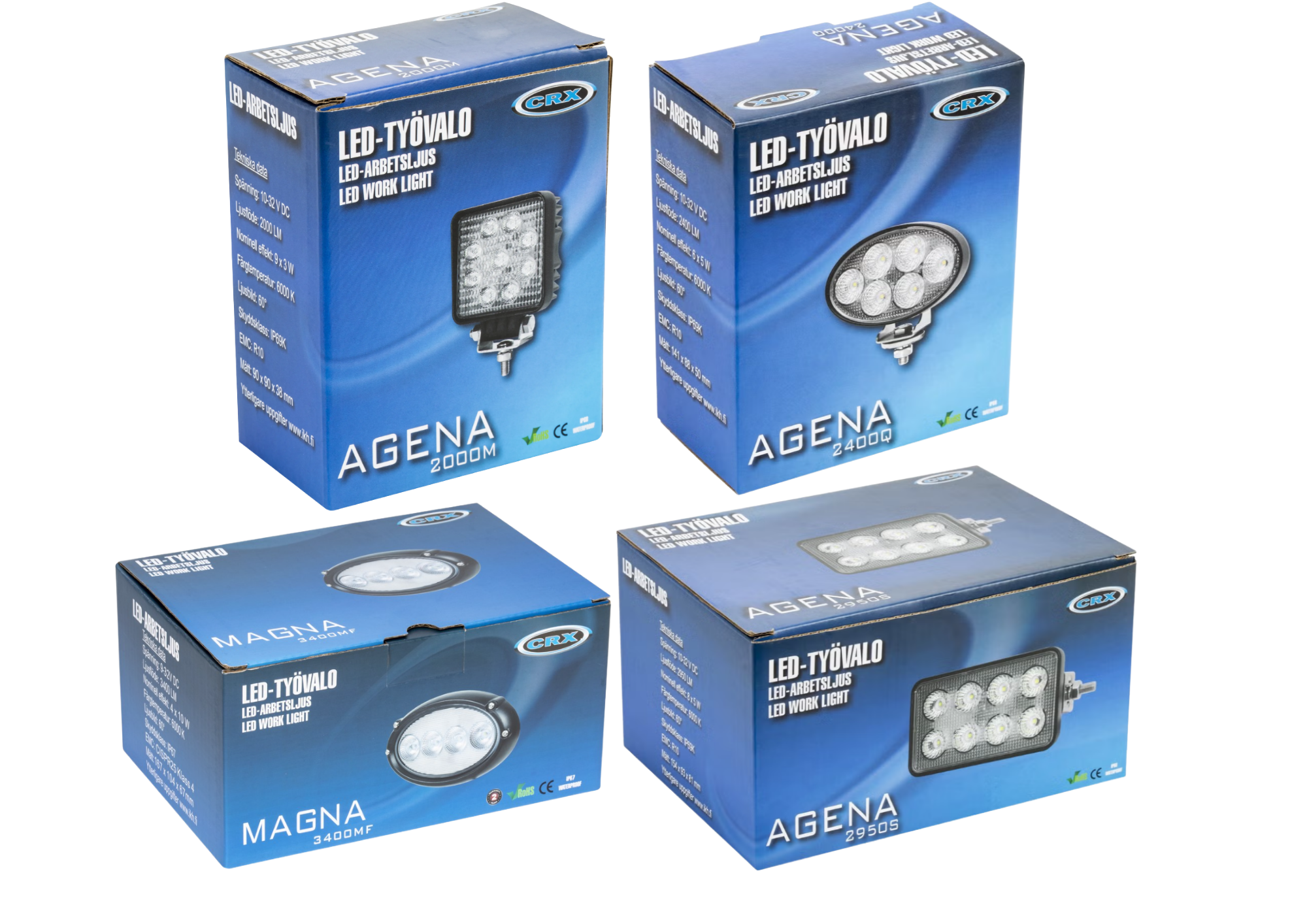
Although the products serve different purposes, the packaging creates a consistent visual relationship between them. The packages are easily recognizable to be a part of a one product family.
08 shelf presence
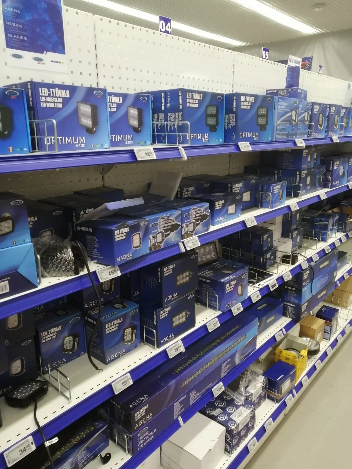
A successful package needs to work beyond the presentation board. On the shelf, recognition, hierarchy and contrast become part of the customer's experience.
Although there are still some items with visuals that haven’t been updated, it’s obvious on the first glance that the whole section is a part of a bigger product family.
09 outcome and reflection
The final direction was built around one clear visual concept that could be applied across the CRX automotive headlight product family. Rather than creating a completely separate visual identity for each package, one strong packaging language was established first. This visual foundation was then adapted to different products, formats and information requirements.
The core elements of the design remained consistent across the range, while the product-specific content was adjusted accordingly. This approach created a clear connection between the different packages and made them feel like part of the same product family.
the process
The process began with establishing the visual direction: creating one strong visual concept that was developed as the foundation for the packaging.
I defined the recurring elements such as typography, colours, layout principles, imagery and information hierarchy for a recognizable look.
The same visual approach was adapted to different products, while allowing each package to communicate its own technical characteristics.
Lastly, the final layouts were adjusted according to the physical format, available information and specific requirements of each product.
a package is not the product
Its job is to make the product understandable. This project reinforced the importance of balancing visual impact with clear communication. In hardware retail, technical specifications, product characteristics and safety information must remain easy to find and understand.
The goal was not to make the packaging simply more expressive, but to make it noticeable, understandable and purposeful.